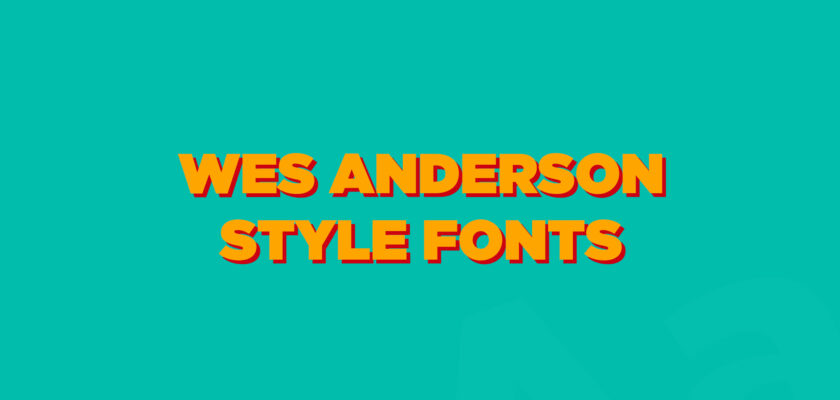
Whenever there’s a discussion about Wes Anderson’s style, people often talk about his whimsical charm, meticulous attention to detail, vibrant color palettes, symmetrical compositions, and blend of nostalgic and quirky elements, but there’s one more important element of his style that often remains ignored.
And that amazing element is Anderson’s typography choices! If you have ever paid attention to texts in his movies, you would notice that he uses retro fonts and most of the time he even uses the same fonts because it’s his own unique style.
So, do you want to give Anderson’s style a try too, and make your designs even more charming and whimsical? If yes, then you are at the right place, because this article is completely dedicated to Wes Anderson movie fonts.
Here you will find the fonts most frequently used by Wes Anderson and the typefaces that perfectly match his style. Therefore, make sure to read this article till the end because every font mentioned here can easily help your projects get a lot of attention in no time.
11 Wes Anderson Fonts
Wes Anderson doesn’t use a variety of fonts, but the ones he picks are perfect, and here are some of them, so make sure to check out each!
Tilda Grande
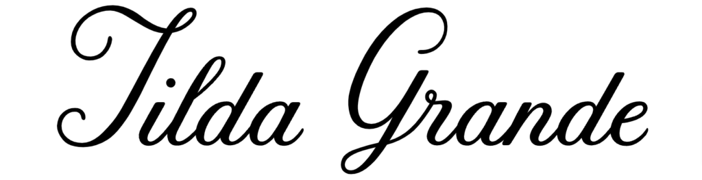
Moonrise Kingdom is Wes Anderson’s most successful movie, and surprisingly, Tilda Grande was used almost everywhere in that movie. From the title to the credits to the texts that appeared in the movie, you could see it just everywhere.
However, since the movie’s theme and Tilda’s vibe match perfectly, it was hard to notice that the same font was used throughout the entire movie. So, whether you are working on a Valentine’s Day project, wedding decorations, or a marriage anniversary design and you need Wes Anderson style, then do not forget about Tilda Grande!
FUTURA Bold
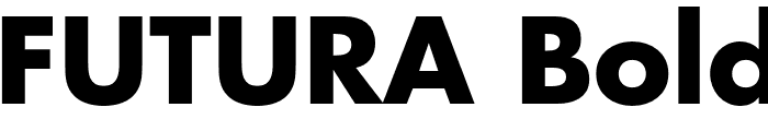
Did you know Futura Is Wes Anderson’s favorite font? He has used this font in multiple movies, which easily explains how much he loves this typeface. He also uses its other versions, like Futura Bold.
So, If you go and watch The Royal Tenenbaums again, then you may notice Futura bold a few times in the movie as credits or titles. Futura Bold is just a versatile font and is an amazing option for display works, so there’s no doubt why Anderson loves this font this much.
Great Lakes Shadow NF
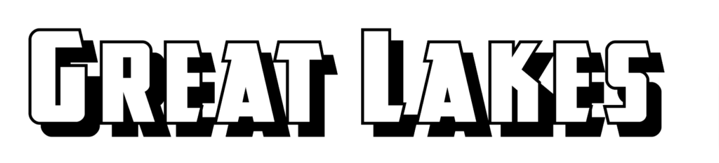
Asteroid City’s title looks extremely vintage and nostalgic, right? Do you want to use that font for your project? If so, then unfortunately you can’t, as that font is a custom work, but luckily there’s a good alternative, which is known as the Great Lakes Shadow NF.
It’s designed by Nick Curtis and has a decent retro look, just like the one used in the movie’s title. It’s good for classical designs, logos, and headlines, so feel free to use it in designs that need a nostalgic touch.
Archer
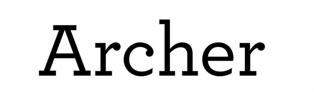
Grand Budapest Hotel was also another iconic movie by Wes Anderson, and it was the first time he didn’t use Futura for its texts or titles; instead, he picked a new font, which was another custom work.
But do not worry, as Archer is the perfect alternative to it. It looks exactly like the Grand Budapest Hotel font and is a popular humanist sans-serif font that can provide you with some elegant designs. It works well with both display and text projects, so craft some gorgeous things with it soon.
DM Serif Display
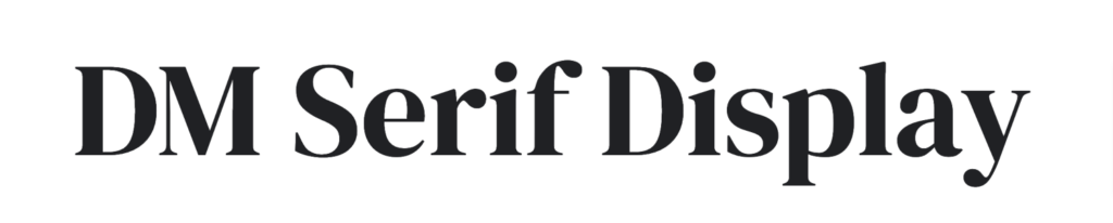
Introducing a decent high-contrast font, DM Serif Display, which is designed by Colophon Foundry. DM Serif Display was never used by Wes Anderson, but the reason it’s on this list is because it perfectly fits the Wes Anderson movie fonts.
Yes, you read that right; it’s an elegant display font, has a good classical design, and is super versatile, which are some important characteristics of Wes Anderson fonts.
DM Serif display can be used for a variety of projects, especially display ones, so start designing some retro-looking advertisements and branding projects with it.
Ciens Delomis
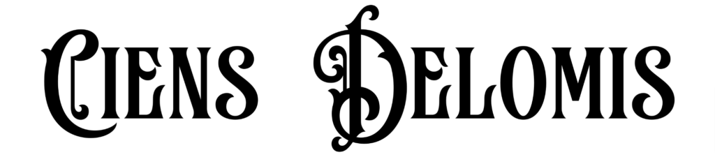
By now, you must have noticed Wes Anderson uses only retro and vintage fonts in his movies, so here’s another classical font that matches his style. This font is known as Ciens Delomis, and it was designed by Warisand.
It’s popular because of its stylish looks, which can easily attract a large audience without much effort. And since it’s so detailed, it will obviously be a good pick for display works such as poster and flyer design.
Bremlin
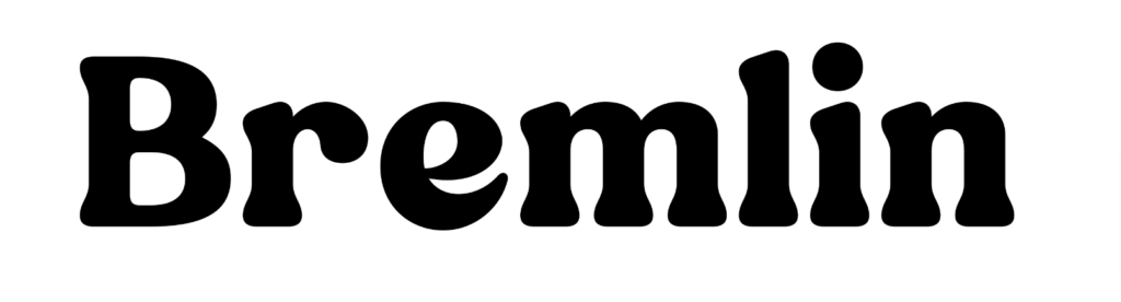
Wes Anderson-style fonts are often bold, so let’s take a look at Bremlin, which is also a bold vintage font designed by Grezlinestudio. The best part about this font is its stylish look, which can even remind you of Wes Anderson’s whimsical aesthetics in his movies.
Moreover, Bremlin is also an amazing choice for display designs, thanks to its clean and readable design. You can use it for beautiful designs, movie posters, or website logos easily!
Didot
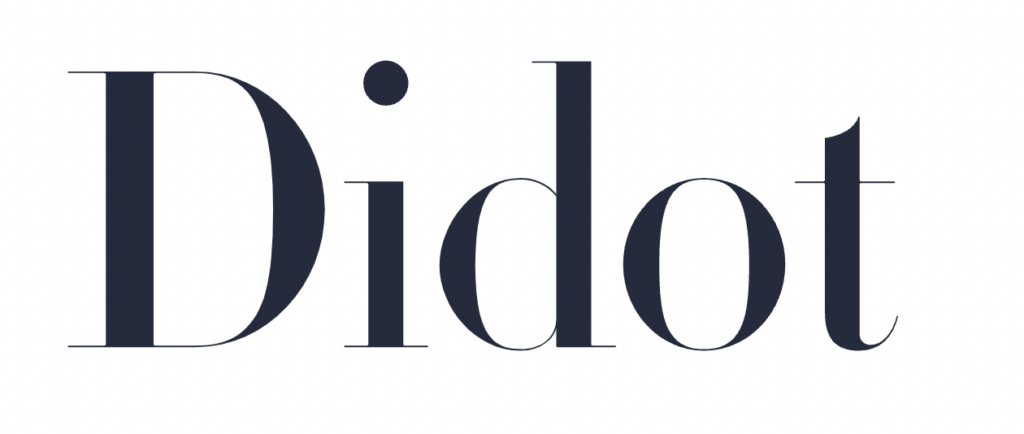
Wes Anderson doesn’t prefer modern fonts, but when he does, he picks some amazing fonts like Didot! It’s designed by Linotype and is a popular modern display font used by a huge number of Vogue magazines.
This font is clear and easy to read, which also makes it a good option for your main text in projects like YouTube thumbnails, shop logos, and newspaper headings. Didot looks pretty professional as well, so consider using it in formal work too; it will surely help you reach new heights.
Cheapsman
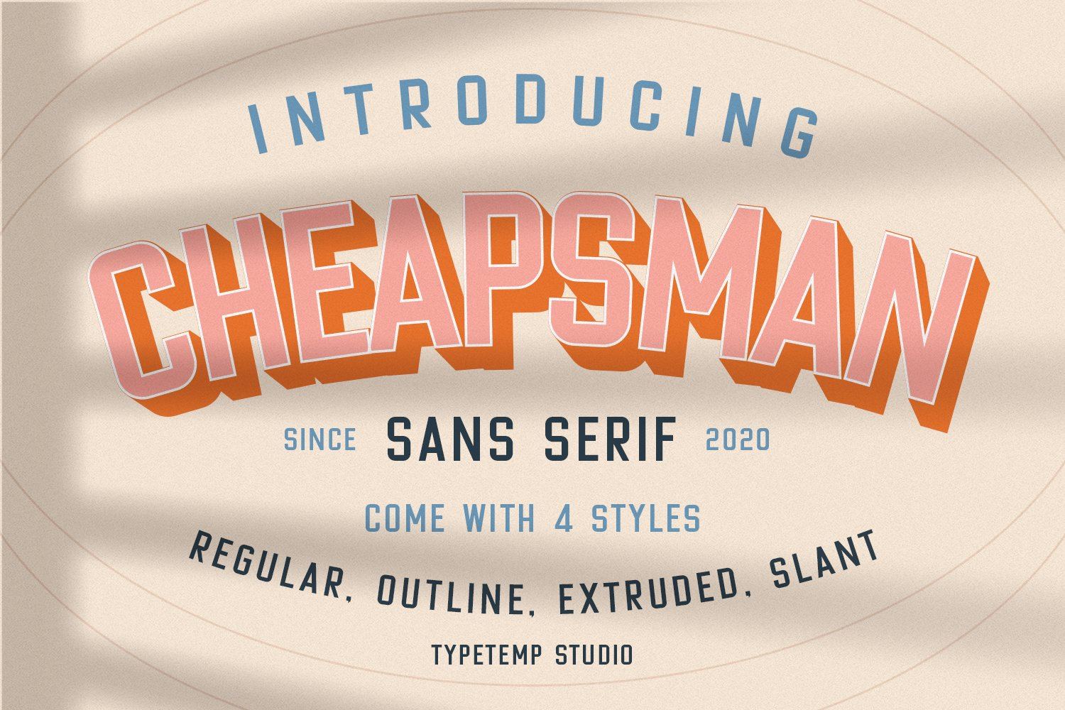
Remember Asteroid City’s logo? We already mentioned its font is a custom work, which can disappoint many people, but at least there are some good alternatives like Cheapsman!
This font is designed by Typetemp Studio and is a perfect alternative to Asteroid City, as it follows the exact same letter style and has a cool shadow design too. Furthermore, in case you want to craft some more unique designs with this font, feel free to try out its outline and extended versions too!
Poster Gothic

Are you looking for the Asteroid City font alternatives? If yes, then here’s another one, which is known as poster Gothic. It’s another decent bold font with a simple yet nostalgic design that can easily remind anyone of the Asteroid City’s logo.
However, unlike the other alternatives, it lacks a shadow design, which may make it a low-priority alternative to many people, but still, even without a shadow, Poster Gothic is an amazing alternative that can help you with your posters and vintage designs.
Toronto Gothic
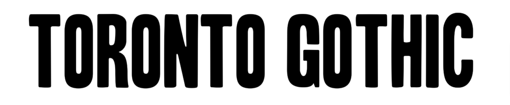
The Grand Budapest Hotel’s font was also a custom work, so why not consider looking for an alternative? Here’s Toronto Gothic, a small yet beautiful font with a really elegant design that works for both display and text work.
If you are printing your book or need a good text font for your website’s headlines and text, then Toronto can be an amazing candidate. Although Archer may be the best alternative, you can still use Toronto Gothic, as it’s an amazing font too!
What Font is Used in the Grand Budapest Hotel?
Unfortunately, the Grand Budapest Hotel font was a custom work, and the font is not available on the Internet. But Archer is the closest font to it and looks almost identical to the Grand Budapest Hotel font.
Conclusion
Wes Anderson’s movie fonts are whimsical, just like his movies, and if you were looking forward to using them in your projects, then we have mentioned the most popular Wes Anderson style fonts in this article.
Make sure to check out each so that you add a decent Wes Anderson style to your work and catch a good amount of attention!
Similar Posts: