The feeling of being worn out and tired isn’t the best in the world, and no one wants to feel it; however, in Font’s case, it’s a different story. In the world of typography, worn-out fonts are considered some of the best fonts, thanks to their ability to express distress and tiredness and make any design look much more natural.
Whether you need some fonts for the lyrics of a sad song or are looking for them for your horror movie or game, these fonts aren’t letting you down!
However, that’s not the end, as there are many more uses for these fonts, but let’s save that for later since you need fonts to use first. Fortunately, you are in luck, as this article is completely about the 11 best worn-out fonts you can find on the internet.
Whether you need them for an edgy-looking website, a Wild West-themed game, or just some horror projects, they have got your back, so check out each carefully!
What are Worn Out Fonts?
Worn-out fonts or distressed fonts are typefaces designed to look aged, weathered, or have a rugged look. On top of that, these fonts include features like irregularities like rough edges, uneven spacing, and missing or damaged portions to simulate the look of old or worn-out lettering.
These fonts are commonly used in graphic design and typography to add a rustic or vintage feel to designs. They can evoke a sense of history, nostalgia, or authenticity and are often used in projects that aim to convey a sense of age. This is why the majority of fonts that mimic the look of old typewriters, vintage signs, or weathered signage can be considered good distressed fonts.
Similar: 10 Streetwear Fonts to Elevate Your Designs
11 Worn-Out Fonts You Mustn’t Miss Out
Every font mentioned here is of high quality; however, some of them are paid, while others are free. However, remember, even with a price tag, they are extremely worthwhile.
Hockeynight Sans Rough
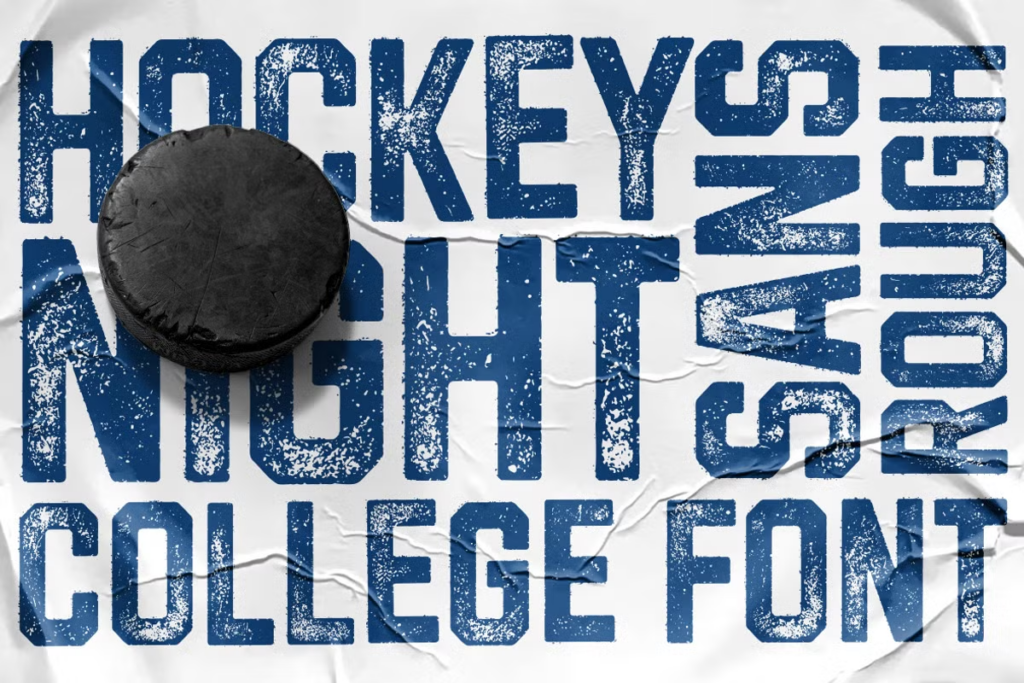
Let’s start with Hockeynight Sans Rough, a bold display font with a great rugged look that makes it look unique. It’s designed by XTOPH-Fonts, and as the name suggests, it’s based on hockey. Consider how rough this game is. Hockeynight was designed especially for college games, not only hockey, which means whether you need a new logo for your football team or rugby, you can use this tough font to represent your strength! However, Hockeynight is a paid font, so you must pay a little to show that power.
Murderous Desire
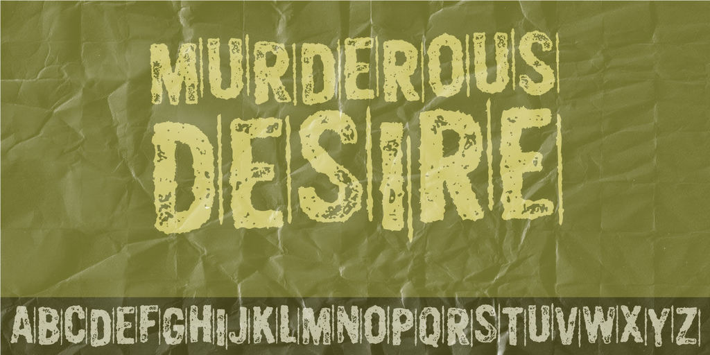
Murderous Desires is another font that reveals its intentions just by its name! This font is designed by Pizzadude and can be a great choice when you want to express impact or mystery in your design. Maybe you want your movie poster to look full of secrets and spookiness, so why not try Murderous Desires for it? It can be a great choice for criminal documentaries as well as Halloween decorations in both sizes while being a free font.
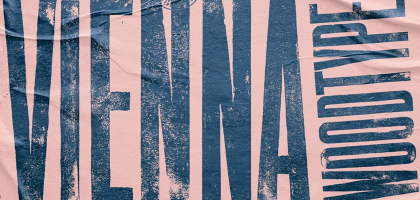
Vienna Woodtype
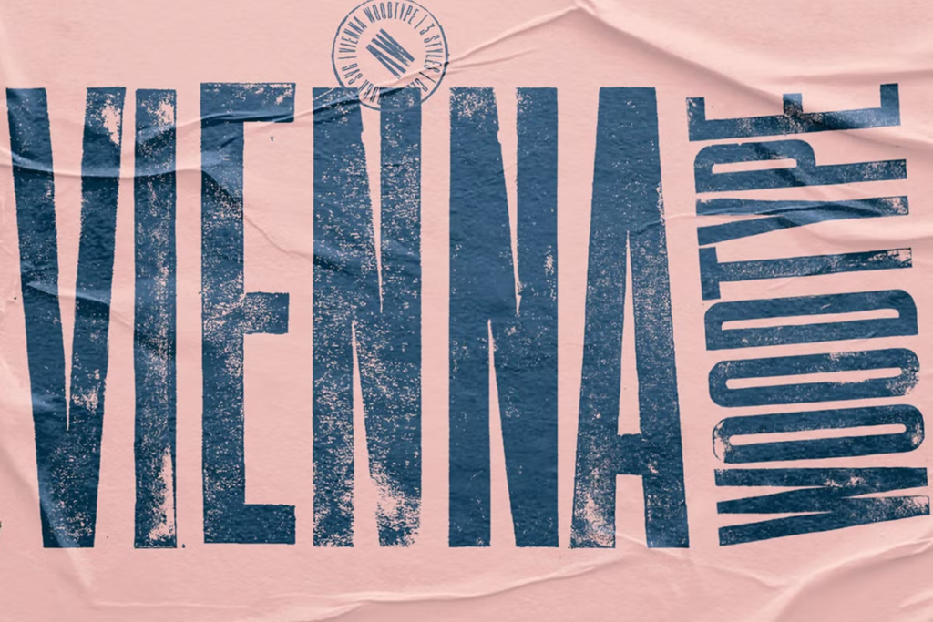
If the previous two fonts seemed too feral or rough and you need something modern that can be used for professional work, then Vienna Woodtype has got your back! It’s based on real printouts, which makes it a good choice for clothing, especially t-shirts. Or if you aren’t a professional, why not just design a custom design and print it on a t-shirt to make it look professional? Vienna is just too good for such works at such a low price!
Plane Crash

Plane crash is a font full of tragedy, as it looks like it just had an accident and now it has countless scratches. This font was designed by The Wondermaker and comes with some plan-related stickers that can come in handy. Other than that, the text looks like it’d make a perfect logo for a movie or game based on wars, plane crashes, or tragedies. The ruggedness makes it eye-catching, so do not miss out on this free font.
Graphitte
You must be wondering what a smooth and clean font like Graphitte is doing here, right? Well, it’s here because we are focusing on its condensed-aged version, a much more rugged and rough version of the original font. It’s so good to the point that it looks like real graphite when used for designs. So maybe you should use it for some chemistry projects, books, or some science fair decorations. It may be a paid font, but it is also a worthwhile choice for science nerds!
Loud and clear
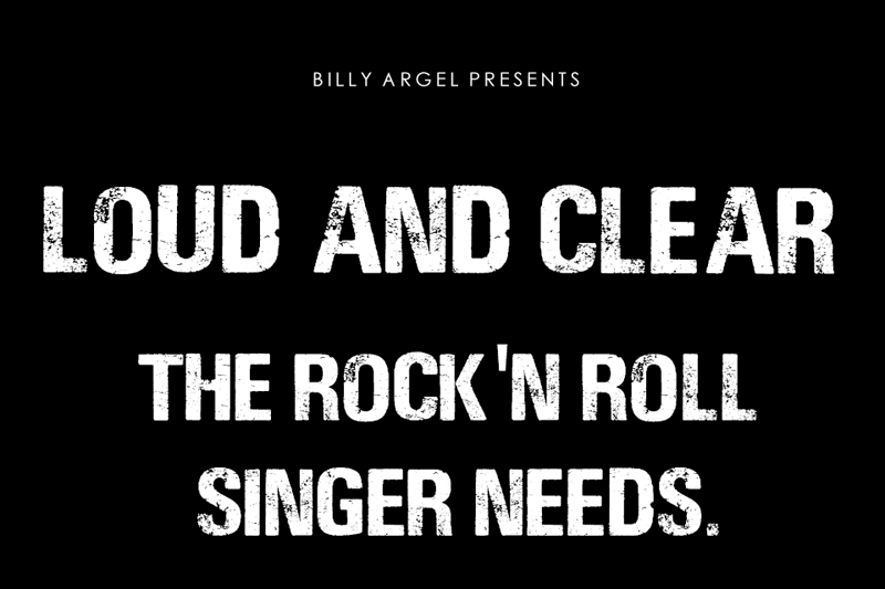
Are you running a professional business? If so, then you need to be loud and clear to make an impact, just like this font! It’s designed by Billy Argel Fonts, and it’s a great display font with the ability to make any startup shine in no time. This font can be great, especially for masculine designs like gym decorations, men’s clothing, or even perfumes. On top of that, it’s completely free to use!
Habanos Retro
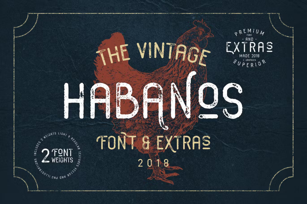
Did you know many distressed fonts are a good choice for retro projects? However, there’s one font that can do this work better than others, and it’s Habanos Retro by Zeppelin_Graphics. Wondering why? Well, it’s because it’s originally based on vintage fonts, which will allow it to have the real feel of an old typeface. Habanos retro can be a good choice for bars, old-styled signs, cowboy-themed products, and more old designs; just make sure it’s a paid font!
The war is Over

War is Over is a lot similar to Plane Crash, as both fonts indicate some tragedy that has passed, which allows them to add a decent distressed vibe to the designs. War is Over is designed by Imagex, and just like every font in this list, it features a good rugged texture, which is a good mixture of dents, scratches, and crash marks, making it an excellent choice for war or accident-based designs! Lastly, just like a plane crash, it’s completely free.
Progress

Progress is a great reward for reaching this point of the article since this font looks just amazing! It’s designed by Billy Argel Fonts and is known for its amazing geometric shapes and wide design, which is pretty unique to see among worn-out fonts. It’s another font that can be a great choice for some quality masculine projects like workshop logos or signage, sports event decorations, or even tattoo studio branding.
Imprimo Letterpress
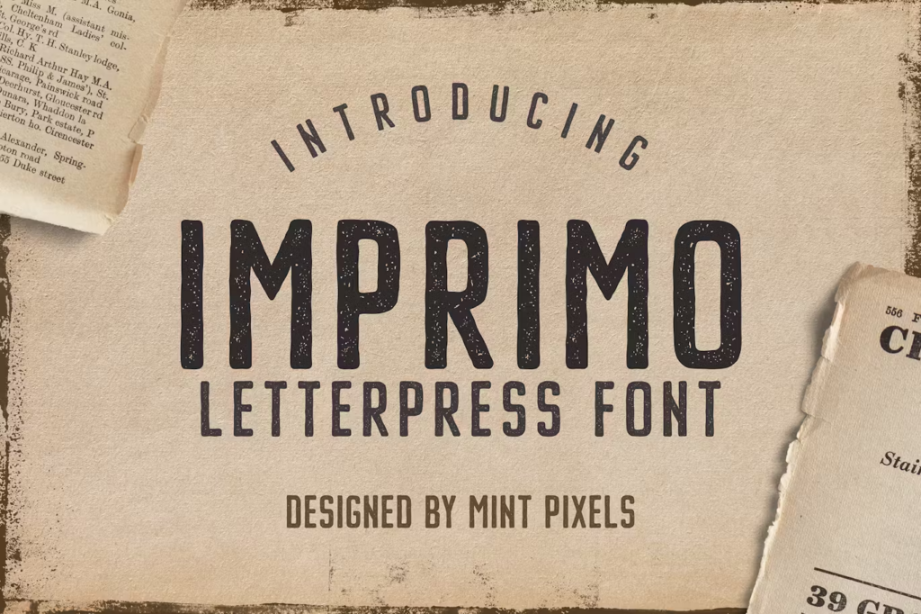
If you love the retro typefaces on this list, then why not take a look at another one? Here’s Imprimo letterpress by Vasaki, a retro font based on old printings like newspapers and billboards. Such printing styles are long gone and anyone barely remembers them, so wouldn’t it be a great idea to bring them back with Imprimo Letterpress? This font is paid, but with a quality like this, it’s worth every penny.
Cralter
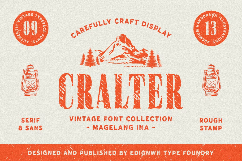
It’d be a shame not to include a font based on the wild in a list of weathered fonts, especially since the place is known for its rugged environment. Cralter by Edignwn is a great example of this; it has the ruggedness of the wild West and is as rough as that environment. You are better off using this font for wild West themed designs, whether it’s for a game or a movie.
Conclusion
Unfortunately, this is the end of these rough yet attractive distressed fonts, which isn’t bad since now it’s your time to pick them and design something amazing! From readability to design, everything about them is just perfect, so start right away!