We all know Taylor Swift for her exceptional singing talent, but did you know she has one more talent that often remains ignored? Well, that unique skill is her amazing choice of fonts for her album arts.
From her debut album in 2006 to her recent releases, Taylor Swift has always picked fonts that perfectly represented the theme and emotions of her albums, which helped the songs reach new heights and become popular in no time. However, since Taylor Swift has never revealed the font she uses for her album designs, many of her fans keep wondering, “Which fonts does Taylor Swift use?”
Fortunately, with hours of research and hard work, we were able to find the Taylor Swift fonts that were used in some of her most popular album designs. If you are always looking for them to create some beautiful typography art, then you are at the right place.
In this article, we have listed popular albums by Taylor Swift and the fonts used for them. So make sure you stick around until the very end.
Whether you want to know about Taylor Swift’s reputation font or Taylor Swift’s folklore font, we will reveal all the fonts Swift has used in her albums, so keep reading to find out!
Related: 12 Handpicked Y2K Fonts
8 Taylor Swift Album Fonts
Before we start the list of fonts, remember that most of the Taylor Swift fonts might be custom work, but there are some fonts available on the internet that are identical to them.
They may not be original fonts, but they are extremely close to real ones, so do not hesitate to use them!
1. Folklore Font – IM Fell DW Pica
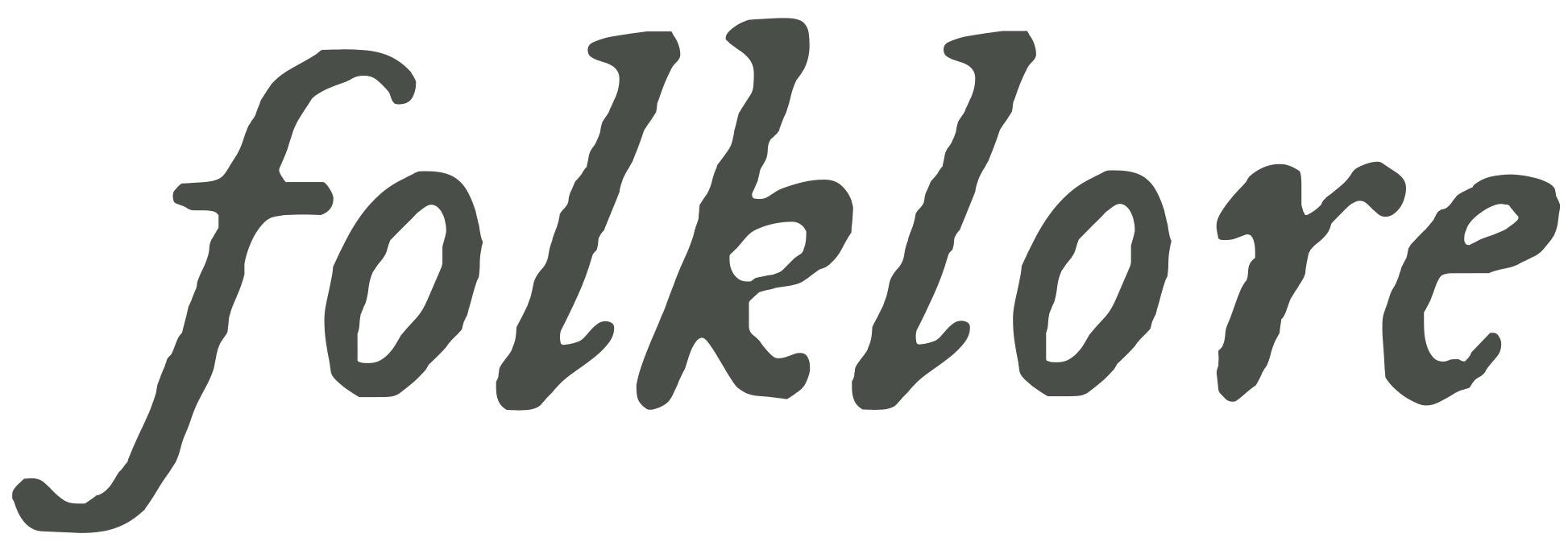
Folklore was the eighth studio album by Taylor Swift, and this album used a font with a typewriter-like design that looks a lot like IM Fell DW Pica by Igino Marini.
IM Fell DW Pica is a typewriter font that leaves an ink effect on its letters to give a retro look, which perfectly suits the gray and vintage theme of Taylor Swift’s Folklore. Maybe that is the reason she used this font for the main text on her album cover.
This font is good for both display and text purposes, as you can see on the album cover. Even Swift has used it for both works, so do not hesitate to do the same.
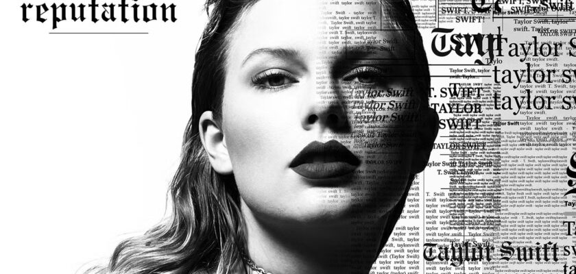
2. Reputation Font – Engravers Old English
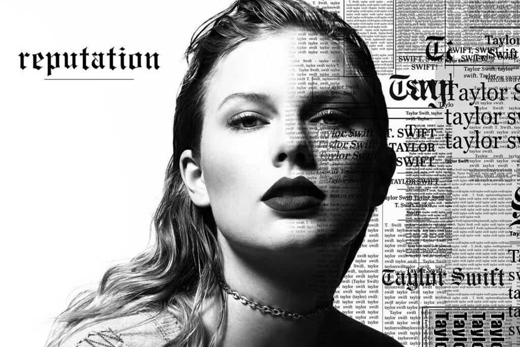
Reputation is probably one of Taylor Swift’s most popular albums, as it introduced us to songs like “End Game” and “Look What You Made Me Do.”
But what makes this album even more interesting is its cover art, which uses a font similar to Engravers’ Old English.
It’s designed by OPTIFONT and is a black letter font. Since Reputation is a dark album, a blackletter font would be the best choice for cover designs, and maybe that’s why she picked a font similar to Engravers’ Old English. If you are also working on something similar, then feel free to use it, as it’s an excellent choice for displaying work.
3. Lover Font – Satisfy
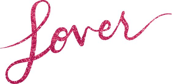
Lover came out in 2019 and surprised us with its bright songs and album cover. The font used for the main text is extremely charming; unfortunately, it’s just a custom work and cannot be found anymore.
However, there’s a font that looks a lot like it, and it’s known as Satisfy. It’s designed by Sideshow and is a brush font, which looks sweet and can help you design some of the most eye-catching texts.
Satisfy doesn’t have as sharp a stroke as the Taylor Swift font used in the Lover album, but it’s still an amazing alternative that can help you stand out.
4. 1989 Font – Permanent Marker
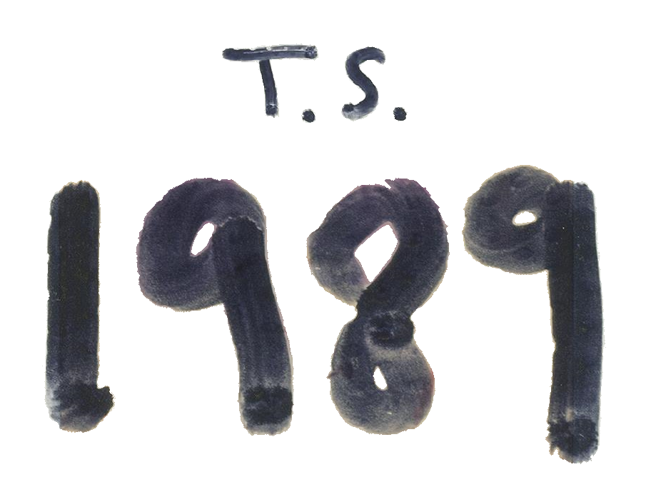
1989 is the most popular album released by Swift, as over 1 million copies have been sold worldwide. And just like other albums, it also had amazing album cover art with a gorgeous font.
The font used in this album matches Permanent Marker, a bold display font inspired by actual markers.
Designed by Font Diner, this font looks like a real permanent marker, and since Swift was looking for a simple yet memorable design, she used a font identical to Permanent Marker.
5. RED Font – Tungsten
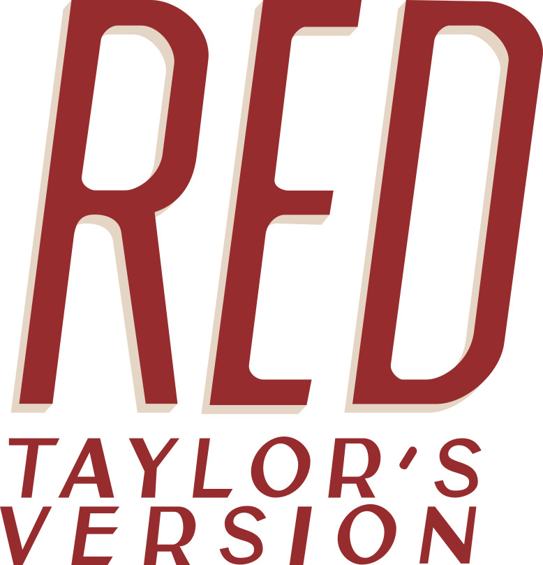
The Red Album of Swift features a striking and modern theme, so she probably needed a bold display font, and in this situation, she picked a font that looks almost identical to Tungsten!
Tungsten by Hoefler & Co. is a bold display font that is often used for display works like logos, headlines, and advertisements. Taylor Swift has used this font for the same reason, as its bold look can easily stand out when used with a striking color like red.
So, if you need some attention, try out Tungsten now and become popular like the album Red!
6. Fearless Font – Archivo
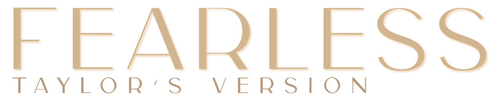
Fearless didn’t just release outstanding songs; it gave us an attractive album cover too, which looks perfect even today. Thanks to the font used for its design, it’s beautiful and identical to Archivo.
Which is a grotesque sans-serif typeface by Omnibus-Type. This font was designed especially for headlines and titles. Swift’s Fearless album art is good evidence of why you should start using this font for your display project. So if you like it, you can get it right away as it’s free to use!
7. Evermore Font – IM Fell DW Pica
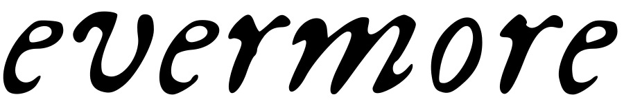
Evermore was an amazing album that surprised us by releasing right after Folklore, and an interesting fact about it is that both albums used the same fonts for their cover art.
Unfortunately, we still don’t know about that font, as it was a custom font, but the closest font to that typeface is still IM Fell DW Pica!
This display font will help you easily stand out with its typewriter-styled letters and attractive looks, so if you want to become famous like the two popular albums of Taylor Swift, then do not forget to try out IM Fell DW Pica.
8. Taylor Swift’s Logo – Satisfaction
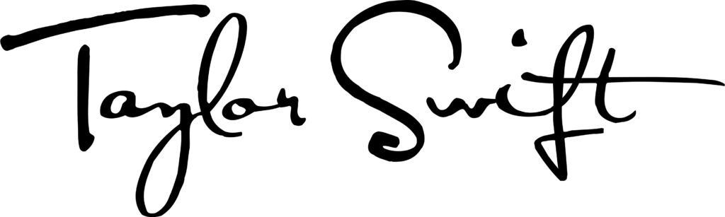
In the end, we would like to talk about Taylor Swift’s logo as well, since it gave her identity. Taylor Swift’s first logo was simple and looked like a signature; the font she used for it was Satisfaction by E-phemera.
Designed in 2006, the logo designed with “satisfaction” was the most long-lasting logo of Taylor Swift, as it remained with her until 2012. Its beautiful and unique looks always worked well with Swift’s songs and made her popular in a short amount of time. which is why Satisfaction remains one of the best Taylor Swift fonts.
Conclusion
Taylor Swift’s fonts are always mind-blowing, thanks to her excellent choices. Whether it’s Taylor Swift’s Folklore font or the Reputation font, they never fail to make her albums stand out, so if you were looking for them, then we have listed the fonts used for the most popular albums.
They are perfect for getting attention and gaining popularity, so feel free to check them out!
More Posts: