If you are a designer or know even a little about typography, then it’s confirmed that you have used Lobster before.
Who doesn’t know about lobster? It’s probably one of the most appealing and popular fonts available.
Even big brands like Disney, MC Donald, and Xbox used this typeface in their logos, but unfortunately, this popularity turned Lobster into one of the most hated fonts.
At present, no one wants to use or see Lobster because of this excess hate.
In such cases, Lobster fans think they have no choice but to forget their favorite font, but that’s not the truth!
Luckily, there are so many alternative fonts for Lobster that can replace them without any problem.
So, if you’re looking for such typefaces, you’ve come to the right place because we’ve compiled a list of the best alternatives to Lobster font.
Some of these fonts are so attractive and pretty that they look even better than Lobster, so you won’t regret using them for sure!
See More: Avenir Similar Fonts
Why Shouldn’t You Use Lobster?
The lobster looks great; it’s beautiful, clean, and easily readable, but using it in your logo design is a really bad idea!
The hate it’s receiving right now isn’t the only reason you should avoid using it.
There are many more reasons that make it a really bad choice.
Here are some reasons why you shouldn’t use lobster:
- It’s Too Expensive
At the time of release, it was free because the designers didn’t expect Lobster to be this successful.
However, as it gained more popularity, it became a licensed font, which means if you want to use it you must buy it first.
This font costs more than $30, which isn’t a lot, but buying a font and getting no success just because people hate it isn’t worth it at all!
Your Clients Will Hate You.
- Your Clients Will Hate You
Imagine creating a portfolio website, getting a good client after a long wait, showing them your portfolio, and having them cancel the deal just because they saw the Lobster font as your logo.
95% of designers or website owners really hate this font, and if your client is one of those, then you are going to lose a good deal.
- There Are Way Better Alternatives
It’s true that Lobster is a really dazzling font, but now it’s time to give a chance to newer typefaces.
There are so many fonts in the typeface world that follow the same style as Lobster
But the difference here is that they are way better than it!
And especially for you, we have listed some of those winsome fonts, so make sure to read this article till the end!
Best Fonts Like Lobster
Here’s a list of fonts you should use instead of Lobster. All of them are beautiful and using them is really worth it.
1. Pacifico
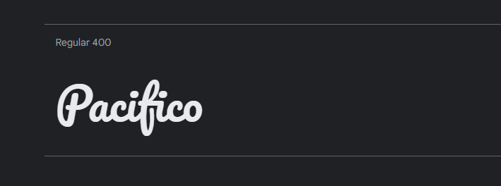
The Vernon Adams-designed Pacifico Font has a calligraphy-like vibe and a brushed script.
It only comes in one style (Pacifico Regular Font)
The Pacifico font can be perfect if you’re looking for informal typography that looks handwritten.
When compared with Lobster, you will realize Pacifico is a better choice because of the way it looks and suits your brand designs!
2. Mission Script
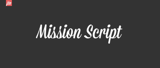
Mission script is probably the most similar font to Lobster you will ever find!
It is bold, beautiful, and cursive! It holds all the qualities a replacement for lobster requires.
Furthermore, the Mission script is a perfect font when your design is placed on objects like billboards or feather flags.
Since it looks really aesthetic when you see it from greater distances.
3. Olivier
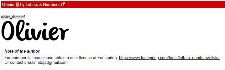
A really charming and free-to-use font. Olivier is something every Lobster fan will love.
Olivier has soft edges and rounded-shaped letters.
Although these qualities are way different than Lobster, you won’t regret using them.
It’s a fun font to use and looks so great on fashion logos, headlines, and short paragraphs sometimes.
4. Blenda
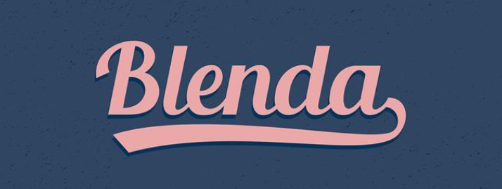
If you are wondering why this list doesn’t contain a font inspired by Lobster, then your wait ends now.
Since Blenda is here!
A font designed by Senior Studios, and the great thing about it is that it’s free for both commercial and personal use. Although it looks like Lobster, anyone will recognize the difference.
So you don’t have to worry about using it in your logos, headings, and posters!
5. Athenia
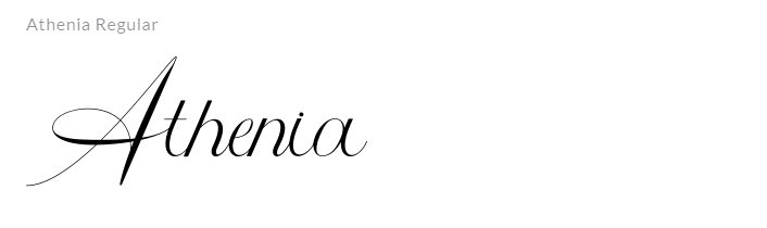
Athenia is a lovely modern calligraphy script font that has beautiful characters.
It is a contemporary take on a traditional ornamental copper script and has great detail to impart a sense of sophisticated elegance and luxury.
It’s true that it doesn’t have features like Lobster, it’s thin and more cursive, but you can still choose this font as a great alternative!
6. Nautilus Pompilius
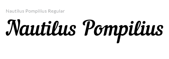
Another great-looking lobster font that will make your logos look really attractive!
It is designed by PUNK YOU BAND, has a unique name, but works way better than Lobster!
7. Siry Italic
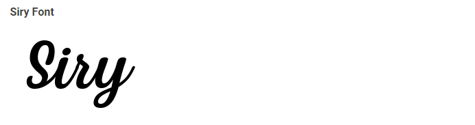
Siry is a gorgeous display script font with swirls.
This font has a feminine, ornamented feel that fits nicely in designs that call for a focal point.
Siry is a free-to-use font as well, which means that unlike Lobster you don’t need to pay for it.
Lastly, since it’s a girly font, it’s better to use it for fashion brand logos!
8. Trumpit
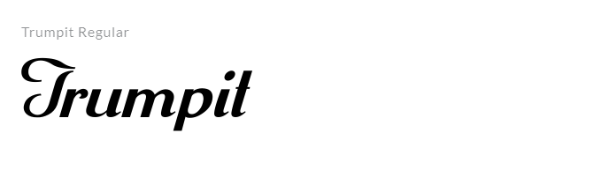
Trumpit is a stylish yet gorgeous-looking font by Typesgal which is free for every purpose!
Use it wherever you want, whether it’s logos, newspapers, or movie posters.
The stylish vibe given by it makes it fit into any kind of design! Check out Trumpit
9. Soe
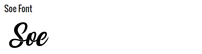
If your brand or designs require a vintage touch, then Soe can get the job done way better than Lobster!
It’s more cursive, more attractive, more elegant, and suits logos way better than Lobster.
So what are you waiting for? This font designed by 7NTtypes is free to use! Check out this font
10. Magnolia
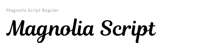
Last but not least, Magnolia is a gorgeous handwritten typeface that has been skillfully created to become a real favorite.
It still has a swanky calligraphic sense about it but feels modern and new.
Get smitten by it and elevate your projects to the next level!
Is Lobster Font Overused?
Unfortunately, yes, Lobster has become one of the most overused fonts ever!
You can say Lobster is the next Comic Sans, which was also an overused typeface.
After gaining a lot of popularity, almost everyone started using Lobster. This included non-designers too.
They used it in unneeded places like hospital logos, house nameplates, and many unnecessary places!
You could see it everywhere and it would be impossible to spend a day without seeing a logo made with Lobster.
Real designers didn’t like this at all. In the end, Lobster became one of the most hated and overused fonts ever.
Conclusion
Lobster isn’t a bad font, but unfortunately, it has become overused, and now its time is up.
As a result, you must give newer, more modern, and better fonts a chance!
We have listed the best alternatives to lobster in this article, so feel free to use them in your upcoming projects!
You may also like: