The font of a document can add glam to your project and make it better than it already is. There are several attractive fonts available.
You can choose from a plethora of fonts and try out different combinations to finally decide which font suits your document.
Playfair display is an open-source font that you can download from the internet.
The design is cozy and looks highly attractive. Moreover, you can download it for free, and hence, you needn’t pay a penny to use the font. The font reminds us of old English typecast styles such as Baskerville.
The font in fact brings out a very English vibe to it. The font stands out from the rest and hence makes a perfect font for headings, subheadings and titles. The font has got beautiful cursive letters and manages to grab the reader’s attention.
Well, if you’re looking for other fonts similar to Playfair, we have a list for you! You can mix and match these fonts to get the perfect combination for your document!
Similar Post: Gilroy Similar Fonts
Playfair Display Font
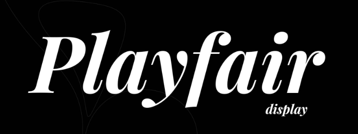
One of the oldest fonts in the calligraphy industry, Playfair display is a popular font that finds its roots in the 18th century. First inscribed by nib pens and steel tip pens.
Owing to its popularity, today the font has found its place in typography as well. On large-scale classification, the font lies in the “serif” category and was designed by a popular Danish typography designer Claus Eggers Sørensen.
The design is used as a transitional font and is perfect to be coupled with Georgia. The font can be used in places where the text must grab the user’s attention.
5 Fonts Similar to Playfair Display
Playfair is an amazing font, however, using the same font everywhere could be boring and monotonous.
Font plays a crucial role in making your document interesting. Mixing and matching the font helps to keep your reader hitched, hence you need to know the similar fonts to Playfair.
Well, don’t go hunting for fonts yourself, here are the top fonts similar to Playfair:
1. Bulgarian Garamond
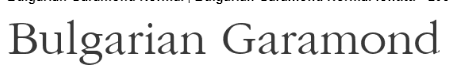
One of the fonts that came into being in the 90s, Bulgarian Garamond is a non-traditional font. Although it is non-traditional, it derives its roots from old European typography.
The vibe given off by Bulgarian Garamond can be compared to that of a Playfair. Bulgarian Garamond is a dynamic font used by millions around the world. Subcategorized as a normal font, the Bulgarian Garamond can be used for body, headings, or subtitles.
Using this font for the text in the body could be a good idea since it is attractive and readable! The italics of the font resemble Playfair and hence, a coupling of both these fonts would be just about perfect.
2. Acta Display

Another versatile font, the Acta display is another masterpiece of fine typography. Acta display is another unorthodox font that was developed in 2010 for a Chilean newspaper.
Acta is similar in many ways to Playfair as it gives the same attractive vibe. The primary advantage of using the Acta display is its variety.
The font is available in multiple formats such as italics, bold, and bold italics, to name a few. Hence, it can be used in the body, title, and headings.
3. HK Venetian
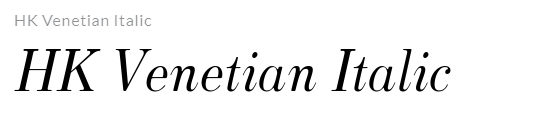
Popularly described as the lost gem, HK Venetian is a recreation of another ancient typographic style called Venetian by Morris Fuller Benton.
The font gives off a very ancient vibe that you’d get straight off from a manuscript. We can draw several similarities between both the fonts, however, the primary similarity would remain that both HK Venetian and Playfair are few of the first fonts in the history of typography.
4. Trivia Serif

Belonging to the famous serif family, trivia Serif is another font that has a lot of resemblance with Playfair. Unlike Playfair, Trivia Serif was developed in 2012. However, both trivia serif and Playfair belong to the same family.
Developed by Czech designer František Štorm, the font is a modern genius. Today, the font is one of the most used fonts and is generally used for the body of the text.
5. CMU Classical Serif
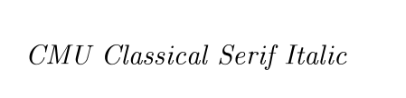
Another font belonging to the serif family, the CMU classical serif is underrated. Although it isn’t very popular, the font has great readability and is highly attractive.
The CMU classical serif was designed by Carnegie Mellon University and hence the abbreviation. CMU classical serif belongs to the same font family as Playfair, and hence draws similarities with it!
Fonts to Pair with Playfair Display
Font pairing is a great way to enhance your documents. When done masterfully, font pairing could be the key to making your document interesting to read for the readers.
The right font pairing needs a good understanding of design. Just like matching outfits, matching font styles with one another is equally important. You must ensure that you match the right fonts that suit each other.
Here are the top fonts that you can pair with Playfair:
- Poppins
- Lato
- Muli
- Montserrat
- Avenir
- Gilroy
Conclusion
Today we’ve seen one of the most popular fonts in typography, the Playfair display. It is an original font whose origin dates way back to the 1800s. We’ve also seen fonts similar to it, and other fonts which you can mix and match with the Playfair display.
More Posts: