Nutella is an Italian chocolate-hazelnut spread brand that has always made our breakfasts tastier than ever. Whether it’s with bread, strawberry, or cookie, once a sweet dish is dipped in Nutella, its taste becomes a hundred times better than it was. which is the reason kids all over the world are in love with the tasty chocolate spread.
However, today we aren’t here to talk about Nutella’s taste since in this article we are going through the detailed history of the Nutella logo. It’s one of the most popular logos, which has made this brand really popular, and surprisingly, it hasn’t changed a lot as it’s already a perfect design.
From its name and logo design, anyone can easily tell this brand produces something tasty, but that’s not all. There’s still a lot, and most people don’t know about the Nutella logo. It has some hidden meanings, which will be revealed later in this post. So make sure to read this article to the end and don’t miss anything.
Related: NBC Logo: History and Meaning
Nutella Logo Meaning
Nutella is a combination of two words, “nut” and “ella.” The “nut” in the name stands for hazelnut, an ingredient that is used to produce Nutella, and “ella” is a Latin suffix that indicates sweetness and happiness.
The logo is bold for high visibility so that it can be read from long distances. And lastly, the color red is used to attract customers to Nutella. since this color is really attractive to the public, it also indicates the sweetness of Nutella, and because the brown color of chocolate isn’t captivating, they decided to go with the red color.
This logo has no outlines or background so that the letters can get some good clarity and always appear more clear whenever someone looks at them.
Why Is The N In The Nutella Logo Black?
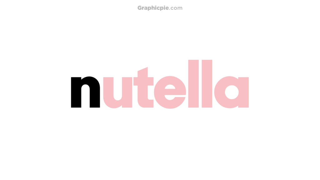
This is a really common question; that black N from the Nutella logo keeps people confused, and they wonder why it’s designed like that.
Then the answer is: The N in the Nutella logo is black because, when Nutella came out, there was already a company with the same name, and their logo was red as well.
Ferrero, the owner, and creator of Nutella wanted to avoid trademark issues, which is why he decided to make the N black so that it looks appealing and unique.
At first, it may not sound like a good idea, but that black N adds decent attractiveness to the design, making it more eye-catching. That black color looks like dark chocolate’s color too, which means this small, dark N defines their brand as well.
Nutella Logo History (Evolution)
As we have mentioned before, the Nutella logo hasn’t changed a lot through the years. Ferrero changed Nutella’s logo only twice, and both times the logo was almost identical, so let’s learn more about the Nutella logo evolution.
1951 (Giandujot Supercrema)
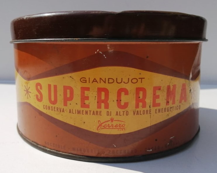
1951 Nutella wasn’t Nutella; it was Giandujot Supercrema, which was a completely different product from the chocolate hazelnut spread we know today. It was a block of chocolate that people enjoyed eating with bread. Giandujot Supercrema’s logo was really simple, as it included the product’s name in minimal orange font.
Then there was the parent company name “Ferrero” below the logo in smaller letters. At this time, no one in the world except locals knew about Nutella. Since Ferrero had no plans to release this chocolate spread worldwide.
1964

In 1964, Ferrero’s son joined the company, tried to make some improvements in the recipe, and gave birth to Nutella. When this happened, they decided to sell it throughout Europe.
However, the product’s name was too long and would be complicated for many people to read, which is why they renamed their product “Nutella”! Also, this is where they designed their first Nutella logo, which was the same as the present logo, but the letters were thinner, taller, and maroon in color (except the N).
Once Nutella started selling throughout Europe, it became really popular, and this logo helped them well to achieve this success.
1970

At this time, Nutella had become one of the most popular foods in the world, which everyone loved. So Ferrero wanted to design a new logo that would make them more popular, and that’s how the current Nutella logo came into existence. A minimal logo with bold letters, colored in red and black for an eye-catching style, will help them attract as many customers as possible.
This logo isn’t much different than the previous one, but it’s still more attractive because of its unique design.
About Nutella
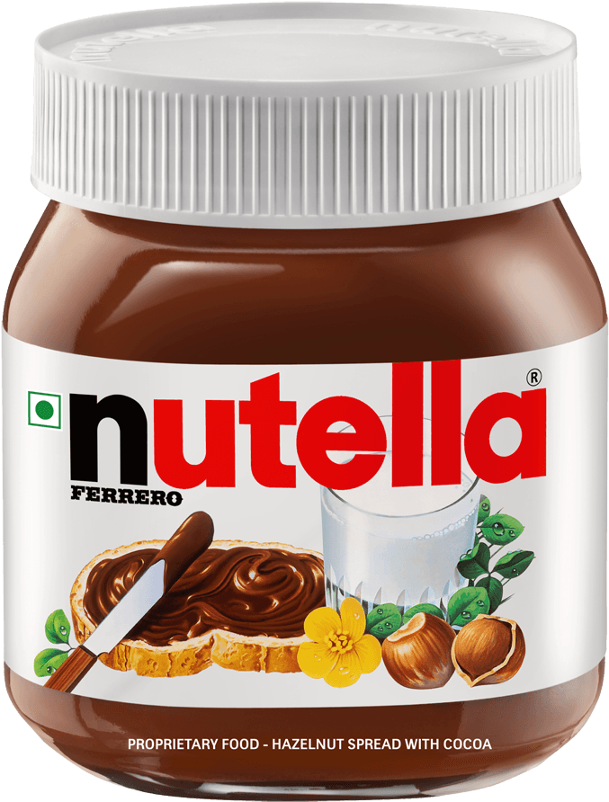
Nutella is an Italian chocolate hazelnut product manufactured by Ferrero. This product was actually created in 1951 and was known as Giandujot Supercrema. At that time, it was just a block of chocolate famous among locals, but later it was improved and renamed Nutella. Soon after this big change, the product became really popular worldwide, and from kids to adults, everyone loved it.
Hazelnuts, sugar, palm oil, skimmed milk powder, and fat-reduced cocoa are some of the main ingredients of Nutella. These ingredients provide a good amount of vitamins and minerals, which are good for your health.
Related Posts:
