Who doesn’t know this beverage brand? For years, this company has been selling a tasty drink that can be consumed by people of all ages. It doesn’t matter whether you are a kid, adult, or elder; this refreshing and delicious juice will give you a boost of energy so that you can keep working! which is the reason this brand is known today as one of the most popular and successful beverages worldwide.
However, aside from its amazing taste and popularity, there’s one more good thing about Mountain Dew, which is its iconic logo! Did you know the Mountain Dew logo is one of the most recognized logos in the world? Still, it’s ignored often, and that’s why in this article we are going to talk about it.
From its history, design, color, font, and evolution, we are going to explain everything you need to know about it. So make sure to keep reading so that you get to know about the full history of the iconic Mountain Dew logo!
Related: Nutella Logo Meaning & History
Mountain Dew Logo History
A brand needs to update its logo again and again in order to become recognized and popular; Mountain Dew is no exception, which is why they have also changed its logo multiple times throughout its history. Check out all the Mountain Dew logos listed below.
1948 – 1969
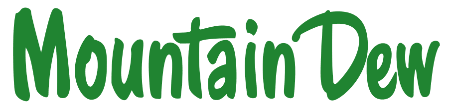
This was the year Mountain Dew entered the market, and to do this, they designed this simple and cartoon-styled logo. The characters were green as always, and it seemed like they were drawn with a pencil or brush because Mountain Dew was looking to attract young customers at that moment.
These letters are elongated but not straight, which adds a quite funny look to the design. Lastly, this logo remained with the brand for 20 years before being replaced.
1969 – 1980
1969 was the year when Mountain Dew’s logo started taking the shape it is right now. This logo was completely different from the previous one as it had a totally new typeface, which looked really modern and fit well with the brand. Now “Mountain” was above “Dew,” instead of the right side, to give a futuristic look.
Instead of only green, now this logo’s colors are red and green. Green for the mountain and red for the dew, but these colors were darker than previous ones.
1980 – 1991
Surprisingly, not much changed in the 1980 logo, but the main update we could see here was the brighter color. Maybe dark colors for an energy drink’s logo were not appealing; that’s why Mountain Dew opted for brighter and more vivid colors so that the logo looks more appealing and can attract more customers. Curves were also removed from the letters since now they look more sharp and smooth.
1991 – 1996

Again, Mountain Dew made no changes to their logo design, but it surely adjusted the colors yet again. Now, the colors are even brighter than before. The green color got a lime or grassy tone, which easily represents the refreshing and natural feel of the beverage. The red color didn’t have any changes, but it still looked brighter.
Lastly, the letters were taller in this version than in the previous one, which gave it better readability. This new look was supposed to represent the reliability and amazing quality of the brand.
1996 – 1999
Now, Mountain Dew started using a new font that gave a sharp look to their brand; letters looked quite rectangular with this font and gave a modern look. Again, colors became dark, and green’s lime shade was taken away.
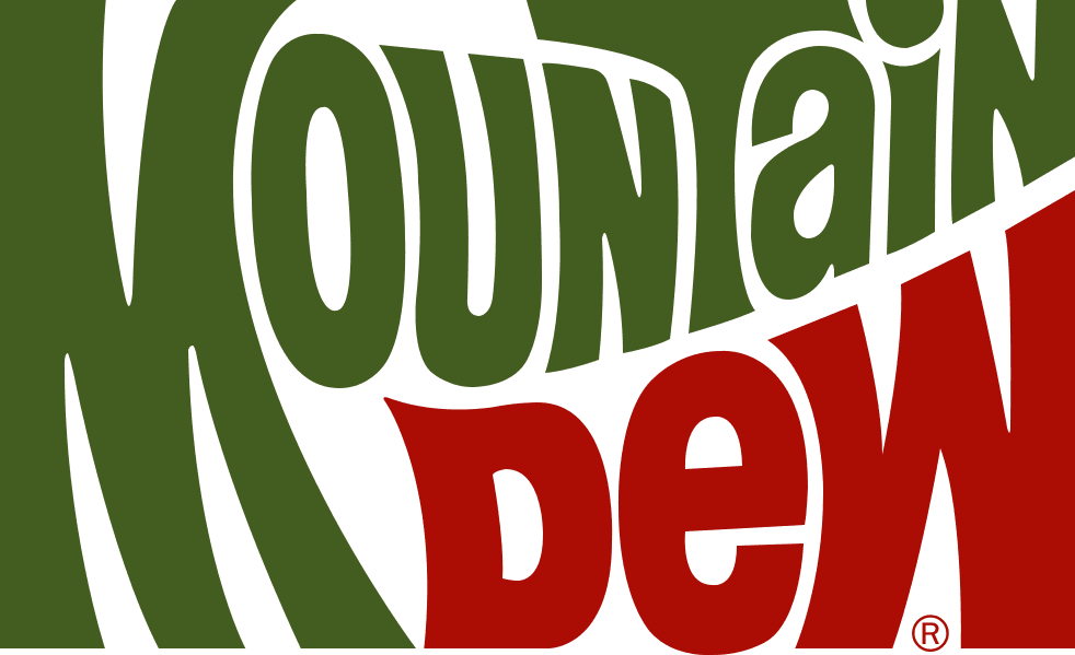
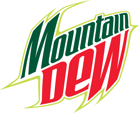
1999 – 2005
This year’s Mountain Dew logo got a huge change with a sharper font, frame, and green shadows. The frame was white, while its outlines were green, and the shadow was green as well. The color of Mountain was now a little bit lighter, and the logo started looking more confident than before.
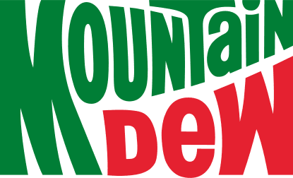
2005 – 2009
Finally, in 2005, the Mountain Dew logo got a completely new look that was way more futuristic and modern than ever. The brand started using a new and stylish font for a better representation, and even the edges of the letters looked sharp for a good impression.
Outlines and shadows were completely replaced with the new lime energy surrounding the company name, which looked really astonishing.
There were no changes in colors this time, and the logo started looking cooler so that a younger audience can be attracted.
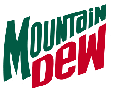
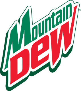
2009 – 2017
2009 finally gave Mountain Dew its current look; in this design, a bold font was used, and instead of Mountain, the Dew looked larger. Also, the letters became really sharp; Mountain’s edges were facing left while Dew’s edges faced right, showing a big, confident, and strong personality.
Another noticeable thing about this logo is that now Mountain has been changed to “MNT,” which is an abbreviation of it. They decided to do this because now everyone knows that it makes them look modern.
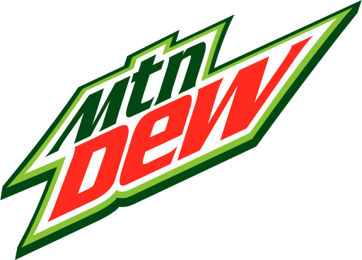
2016—Today
The current and 2009 logos are almost identical; the only difference between them is their shadow colors. 2009’s shadows are green while current logos are black to give an impactful and attractive impression.
Mountain Dew Logo Meaning
It doesn’t matter whether it’s a TV ad or just a poster, the Mountain Dew logo represents confidence, grace, and courage and encourages its customers to fight their fears, and that’s what their logo means as well! which is why their logo design is always bold, sharp, and strong because they represent masculinity and a strong personality.
Fonts and colors
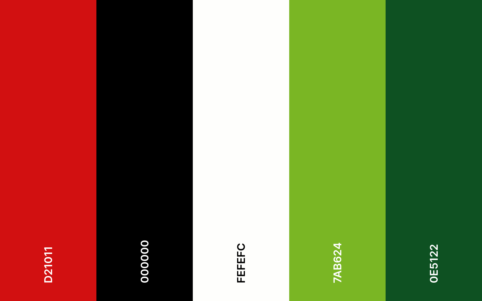
The font used for the current Mountain Dew logo is Air Millhouse Italic, which is a beautiful font with a strong personality.
while the colors that are used in Mountain Dew are green, red, lime, and black. Green is often changed; sometimes they use darker shades or just choose brighter shades for a positive impact.
About Mountain Dew
Mountain Dew is a non-alcoholic carbonated beverage brand popular worldwide because of its energetic and tasty soda. It’s produced and owned by PepsiCo currently, but was originally founded by Tennessee beverage bottlers Barney and Ally Hartman in 1940. At that time it was known as moonshine, but later, with the updated recipe, it became the well-known Mountain Dew.
In 1964, PepsiCo acquired the rights to Mountain Dew, and since then it has been sold in the United States and Canada.
Frequently Asked Questions
The green color in the Mountain Dew logo represents nature and refreshing energy, while the red color is used for an appealing effect.
Just like every other slogan of Mountain Dew, “Do the Dew” also means do not fear the challenges. Take a deep breath or mountain dew and do it right away!
Actually, Mountain Dew was founded in 1940 in Tennessee, and at that time it was the best non-alcoholic beverage. During this time, Mountain Dew was known as Moonshine, but as it gained popularity, it got the name, Mountain Dew.
Later, PepsiCo bought its rights and sold it worldwide; today, Mountain Dew is one of the most popular beverages people drink daily.
More Posts: