Most of the time, people believe that metal bands are only known for their wild and rock music, but surprisingly, this is untrue, as a metal band’s success is also greatly influenced by the design of its logo. Just think about it: there are so many popular bands like Metallica and Black Sabbath that you can easily imagine their amazing logos while you listen to their songs. This happens because, just like a business, every metal band wants its logo to stand out even in the largest crowds.
Usually, a metal band’s logo is highly attractive, stylish, and rocking because these properties easily define their work. Metal fans are also in love with such designs, which is why these logos easily become the center of attraction among the fans. So, do you want to know more about these Metalcore band logos? If yes, then make sure to keep reading.
Since in this article we are going to introduce you to 10 famous metal band logos, reading some information about all these bands will surely make you feel nostalgic, which is why you shouldn’t miss out on anything!
Related: Famous Streetwear Logos & Brand Names
10 Most Popular Thrash Metal Band Logos
Which is your favorite metal band? We have listed the 10 most popular metal bands below, so check if your favorites are available in this collection or not!
1. Metallica

Who doesn’t know Metallica? They are a legendary heavy metal band formed in 1981 by Lars Ulrich. Other members of this band are James Hetfield, Robert Trujillo, and Kirk Hammett. These four have released ten studio albums throughout their careers, which are popular even today!
Like them, their logo is also iconic, as it’s simple in the middle but has a rocking style for the first and last letters. This logo was designed by the group’s guitarist, James Hetfield.
The rocking lines coming out of the letters represent the passion and punk music they produce, while the black color is used to indicate their confidence!
2. AC/DC
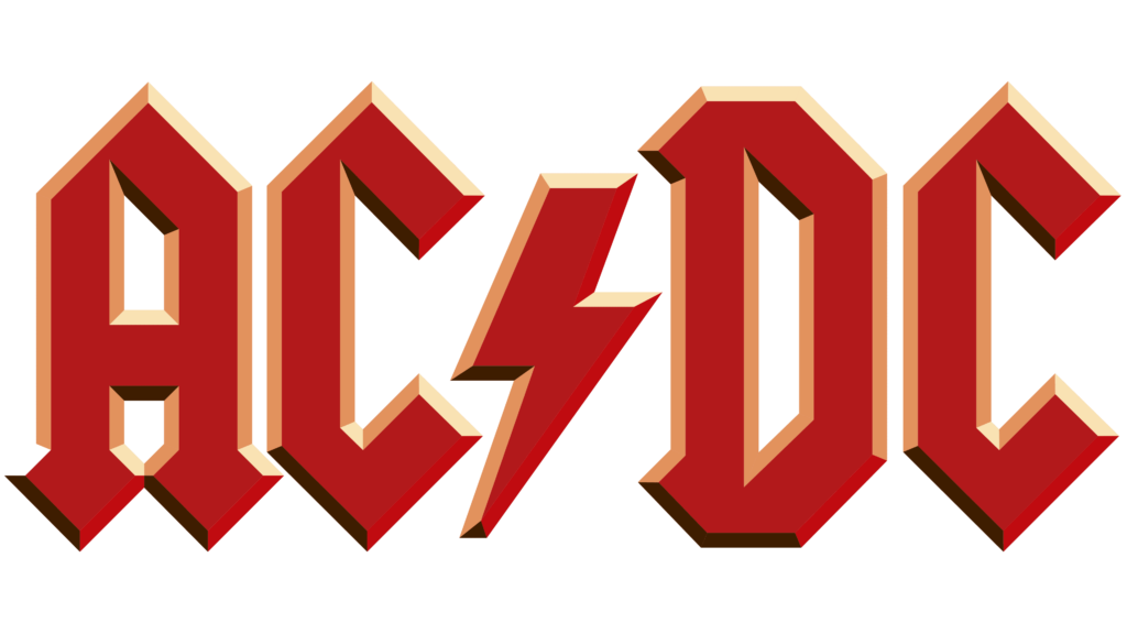
AC/DC is an Australian band founded in 1973. Their logo is an abbreviation of alternative current and direct current, and they chose to go with this name because their music is quite shocking compared to other bands. Not to mention, their many songs are related to electricity, and their debut album’s name is “High Voltage,” which totally makes sense why this band’s name is AC/DC.
AC/DC has changed its logo four times, but every logo has never replaced the electricity design, as it’s what symbolizes their band!
3. Iron Maiden
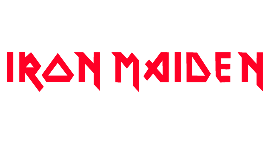
When it comes to the most eye-catching and attractive logo design, there’s no metal band that can beat Iron Maiden. This band was founded in 1975 in Britain, and even today it remains one of the most iconic death metal groups ever. They are also known for their logo since it’s really beautiful and has a rocking look that easily represents their band’s musical taste.
Although they have changed their logo three times, all of them look very similar since they knew they were using the perfect logo from the beginning.
4. Black Sabbath
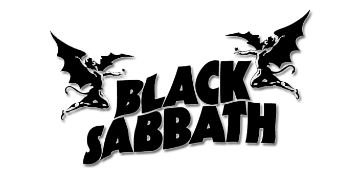
Just like all the legendary bands on this list, Black Sabbath had many iconic logos, but the thing that represented them was an element present in every logo, which was known as Henry. It was a winged devil with a demonic tail and horns that was the mascot of Black Sabbath and was created in 1975.
Henry represented the angelic and demonic traits of this band and its music, and soon after its introduction, Henry became the official symbol of the Black Sabbath because of how easily it gave an identity to the group.
5. Nirvana

Nirvana is the leading metal band of Generation X and has done many controversial things in the music industry. This band started in 1889 and had one of the most memorable logos ever. At first, their logo was just the name of their band, but later they changed it to a smiley with faint eyes and a tongue sticking out.
They have mentioned that they chose this logo because it easily represents how their fans feel during their concerts. Lastly, this smiley has a yellow outline with a black background to add some more energy.
6. Emperor
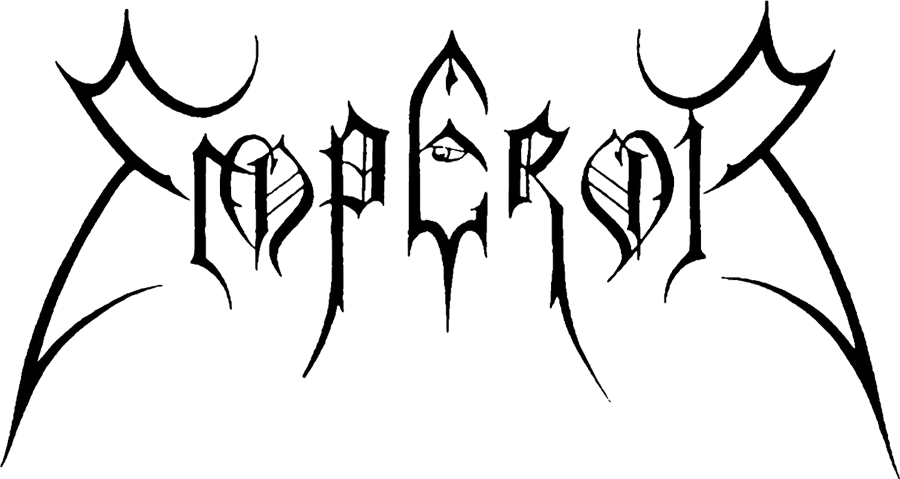
Although Emperor’s logo isn’t easy to read, it’s still a fantastic metal band that can never be forgotten.
Emperor’s logo includes the band’s name designed with a thin and sharp font, which makes it look like the crown of a real emperor. This logo was designed by Christophe Szpajdel, an artist who has designed more than 6,000 logos and has the title of “Lord of Logos.”
Emperor’s logo is designed this way because the band wants to show their metal side to their audience.
7. Morbid Angel
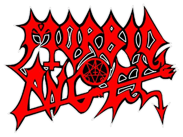
Morbid Angel is yet another amazing band with an unreadable logo. If you look at it for the first time, all you will see are red striking lines everywhere, but if you look closely, there’s a band’s name present in a really rocking style.
Heavy metal fans easily recognize and love such designs, which is why this logo is still popular. In the middle, there’s a Necronomicon available, which represents the rocking devil music they produce.
8. Blind Guardian

Did you know Blind Guardian’s band name is inspired by their own album, Awaken the Guardians? When compared to other heavy metal bands, their logo is quite different, as it’s designed in a royal style, which makes it a completely new concept to the metal music industry.
Most of the time, this logo was colored gold, which represents the band’s hard work, mysteriousness, and richness.
9. Arctic Monkeys

Arctic Monkeys is one of those bands that never stick with the same logo forever. If you look at their history, you will notice all of their symbols look really different from each other. Maybe it’s because they love changing themselves every now and then.
All of the band’s logos had different fonts, which makes them one of the most unique metal bands worldwide. In 2013, they used a completely different design that included frequency, probably to represent their musical work.
10. Megadeth

Finally, this list has come to an end, so let’s not forget Megadeth, which is a really successful thrash metal band. Their logo has always been the same, which includes the band’s name in a stylish and sharp typeface. Even today, Megadeth uses the same logo since that’s what defines their metal band the most.
Aside from the logo, this band had a mascot as well, known as Vic Rattlehead, a skeletal figure that embodies the phrase “See no evil, hear no evil, speak no evil.”
Conclusion
Death metal bands are truly amazing; with their amazing music and iconic logos, they always remain in the headlines and never fail to entertain us.
Above, we have mentioned the most popular metalcore band logos ever. Did you feel nostalgic after getting some information about their logos? If yes, then why not design your own?
Related Posts: