If you’re creating a website or interactive web interface, the first thing you consider will be the user experience. Making your call-to-action (CTA) button more engaging and dynamic can lead to higher conversion rates, such as completing a form or purchasing. Adding a clickable button increases your conversion rate by 28%.
Creating a hover effect for the CTA button provides visual feedback indicating the button is clickable and interactive. Adding a subtle animation or color change also makes the website or application more visually appealing. This makes the button stand out from other page elements and draws attention.
With Figma, creating a hover effect is a cakewalk. In fact, Figma has gained popularity because of its easy-to-use interface and simple design.
So, if you want to take your web user experience to the next level with a CTA button, let’s see how to create a hover effect in Figma in 7 steps.
Let’s dive in!
If you’re new at Figma, check out our Figma guide.
Create Figma Button Hover Effect
Creating a hover effect in Figma is simple. With some basic understanding and practice, Figma can become a reliable tool for all your design needs.
So, let’s look into the process of creating button hover animation in Figma and take your design to the next level!
Step 1: Add a frame on the Figma Canvas
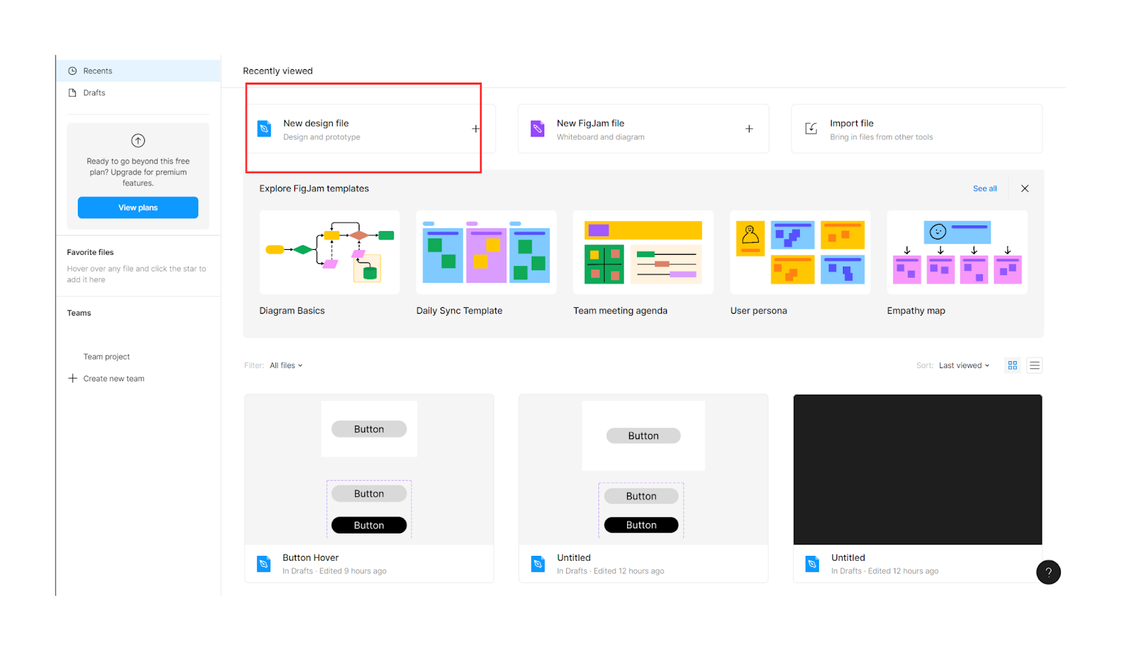
First things first, open a new Figma design file in Figma.
Then select a frame from the toolbar.
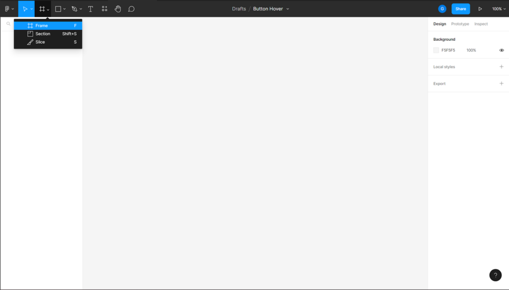
This is how your frame will appear on the Figma canvas.
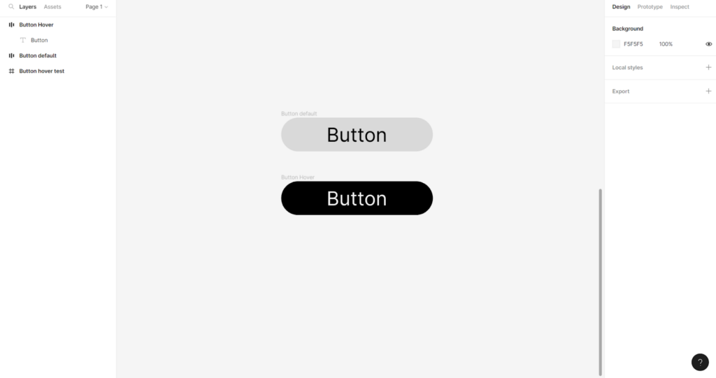
Rename the frame. As this is a demo, we renamed it “Button Hover Test.” Pick a name that will make it simpler to recall the purpose of using the frame.
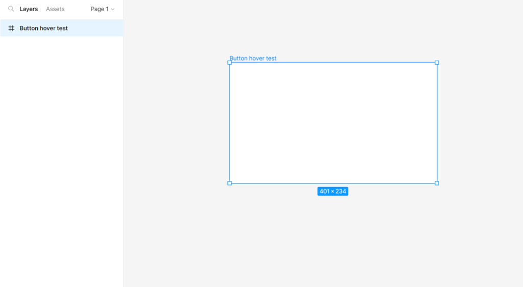
We need the frame for the later part, so let’s keep it on the canvas and move on to the second step.
Step 2: Add a rectangular element
Select a rectangle from the shape elements from the toolbar.
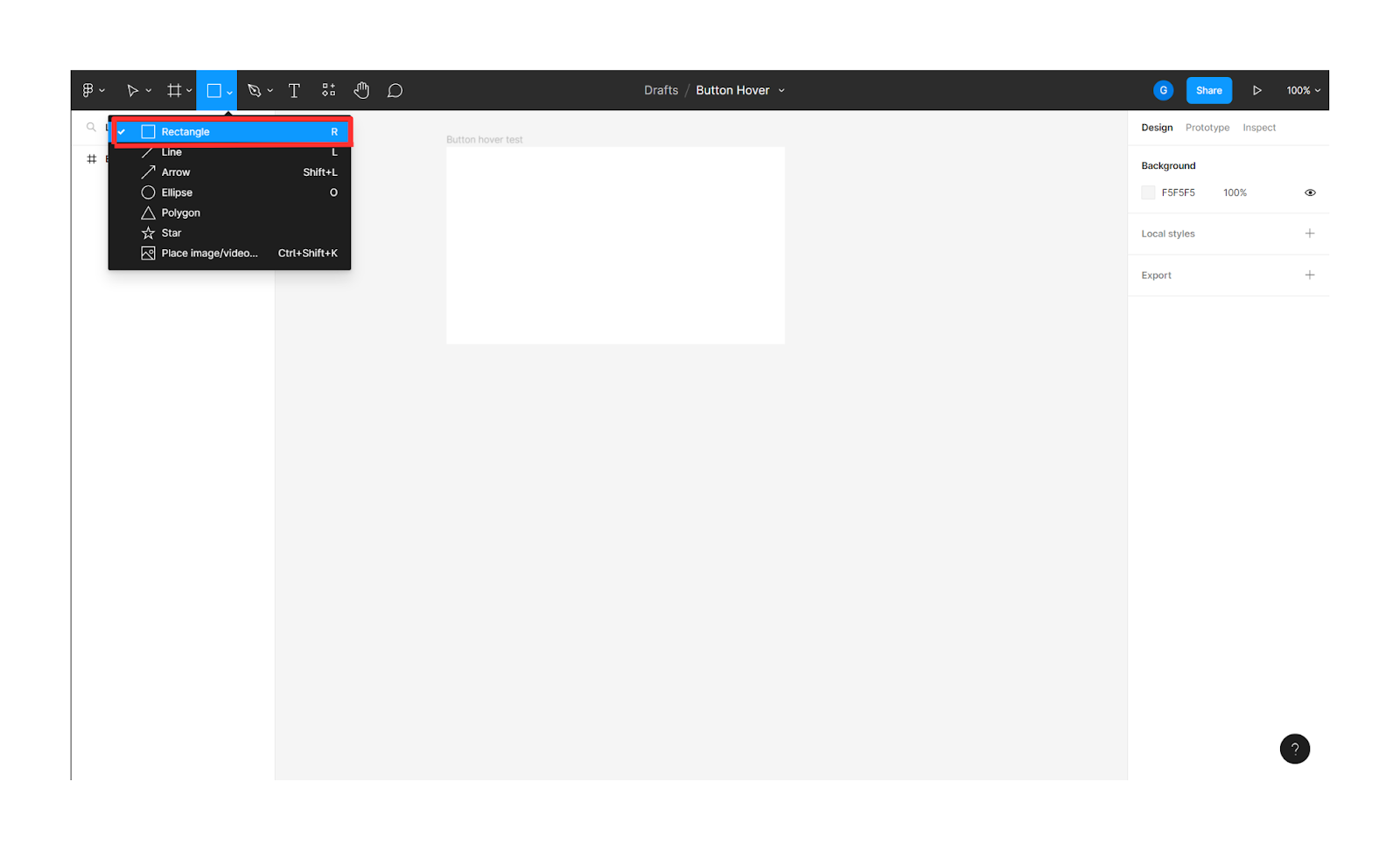
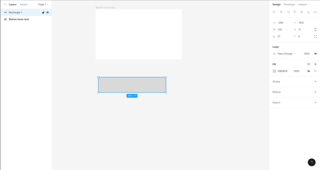
Then create a rectangular component of the size of the button you want on the canvas.
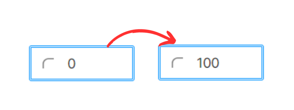
As the CTA buttons usually have rounded ends, let’s change the rectangle’s corners from sharp to round. For that, you need to change the orientation of the corners from 0 degrees to 100 degrees.
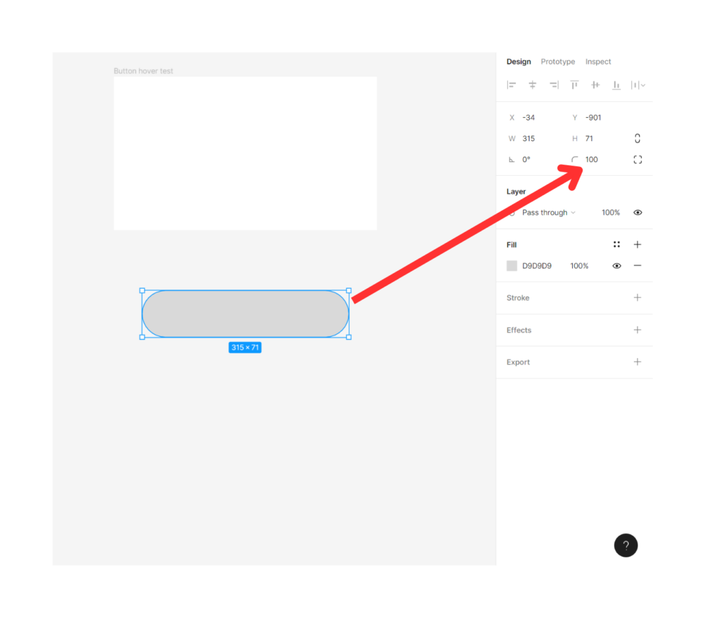
If you look closely at the side menu bar, you’ll see a change in the degree from 0 to 100.
Now, you have the outline for your button in the desired shape.
Step 3: Add text element on the Figma Canvas.
To add text to the button, use the text element from the toolbar.
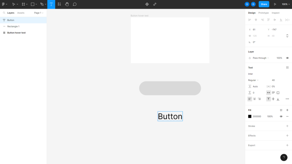
Drag the text on the button and align it to fit in the center.
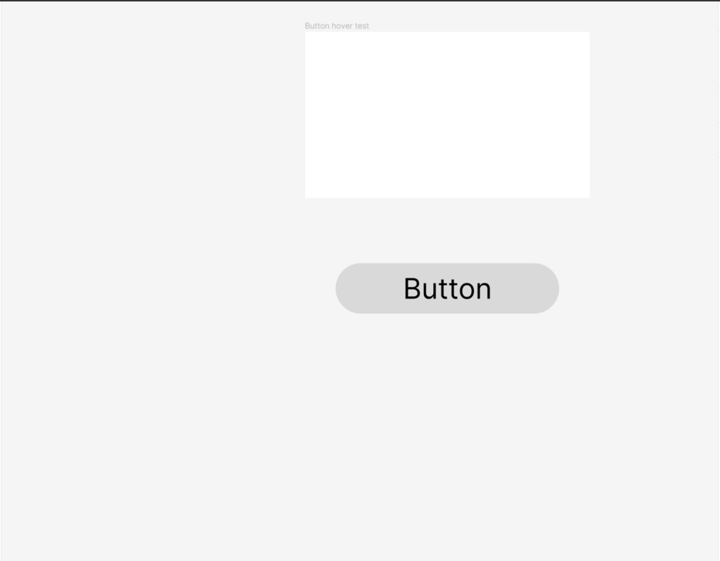
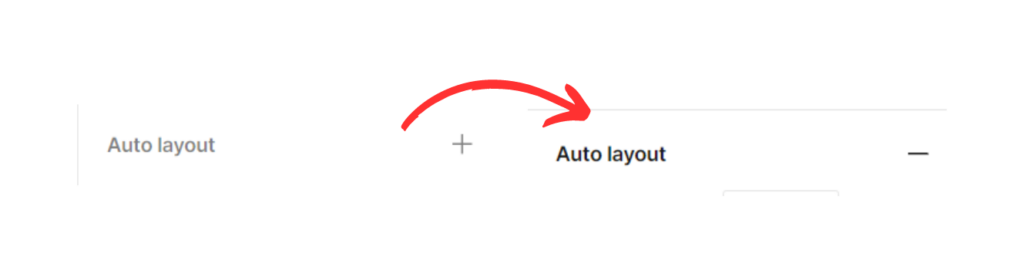
To group the text and the button, click on the auto layout. You’d have the complete button ready now.
The text and the rectangular element become a part of the frame. And you’d notice the sigh alongside the auto layout change.
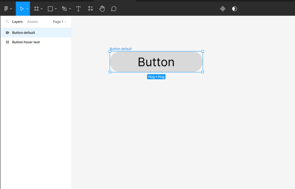
Now that you have your button ready let’s create the hover effect.
Firstly, rename the frame as “Button default,” as it’ll be how the button would look in its default shape.
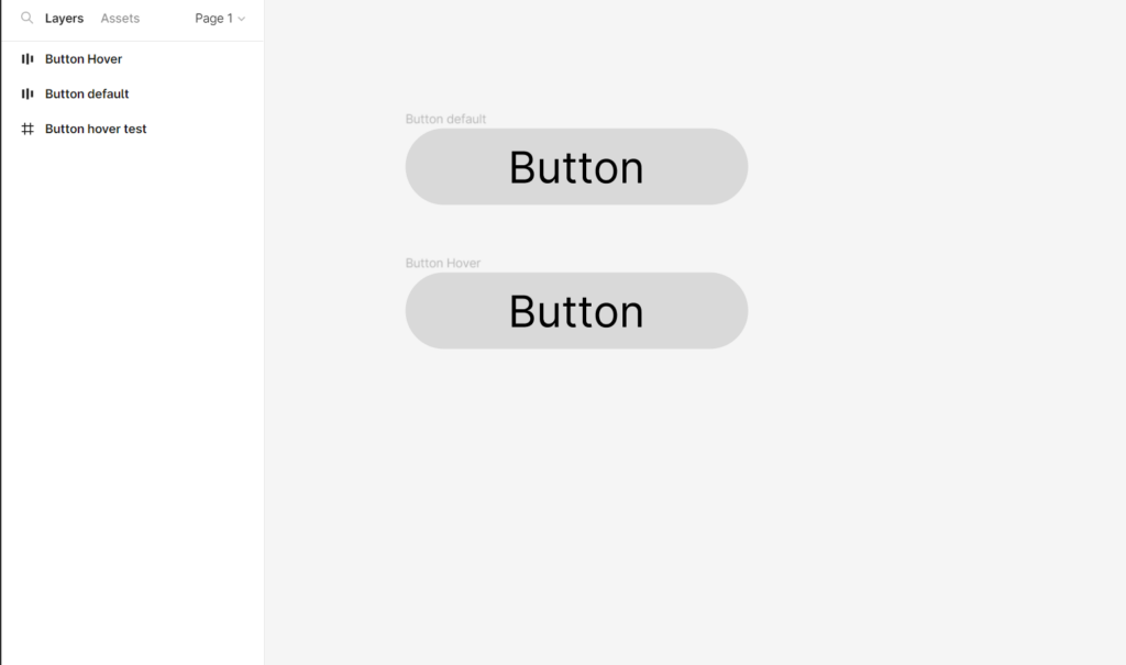
Next, use the copy-and-paste option to duplicate the button. Rename the duplicate button as “Button Hover,” as that’s how it will look when you hover your cursor over it.
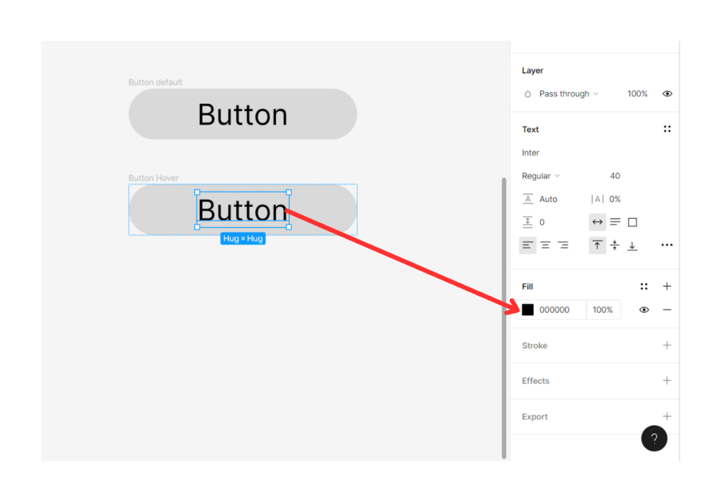
To make both buttons look different after creating the hover effect in Figma, you need to change the color of the duplicate button.
For that, go to the “Fill” in the menu bar on the right-hand side and change the background and text fill for the duplicate button.
After changing the color, you’d get two easily distinguishable buttons.
The next step is to select both buttons and create a component set. With component sets, you can easily manage consistent designs in Figma. To create the hover effect in Figma, you need to keep both buttons in a single component set.
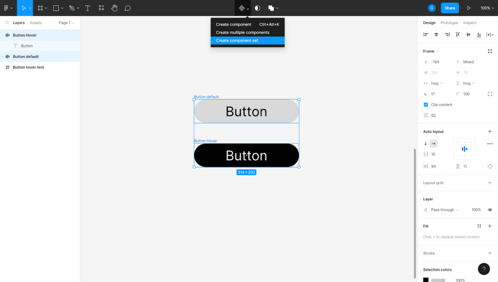
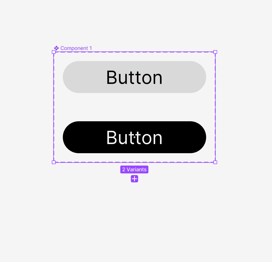
Here’s how your component having two variants will look.
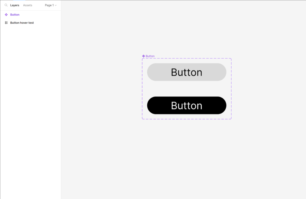
Rename the component as “Button.”
Let’s start creating the hover effect. For that, you need to add interaction between the two buttons.
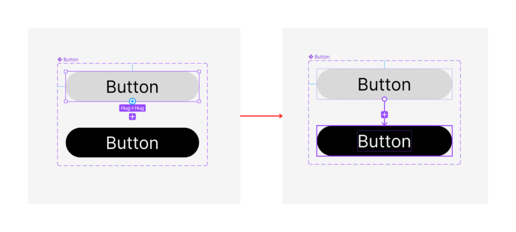
As shown in the image, drag your cursor from the bottom of the first button to the top of the second. You’ll get an interaction table in the prototype menu bar.
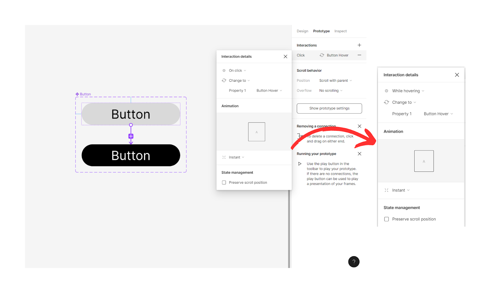
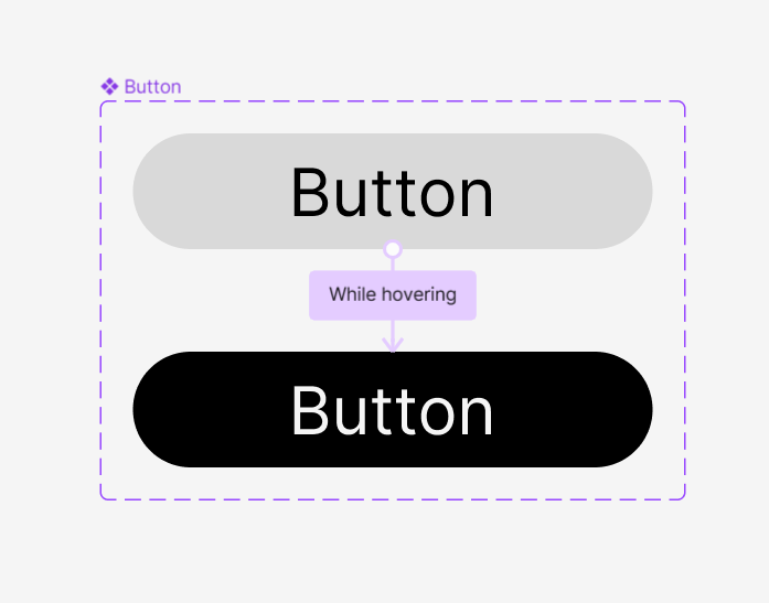
Now, change the interaction details from “on click” to “while hovering.” It’ll create a hover animation figma effect.
Finally, the button with the Figma button hover effect will look like the image below.
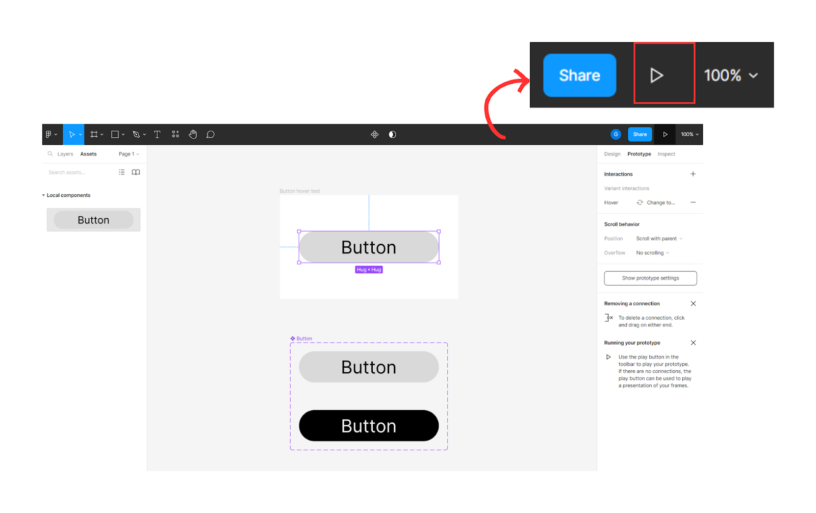
Remember the frame you created in the beginning. It’s time to put that to use.
Select the local component “Button” you created and drag it from the “Assets” onto the frame.
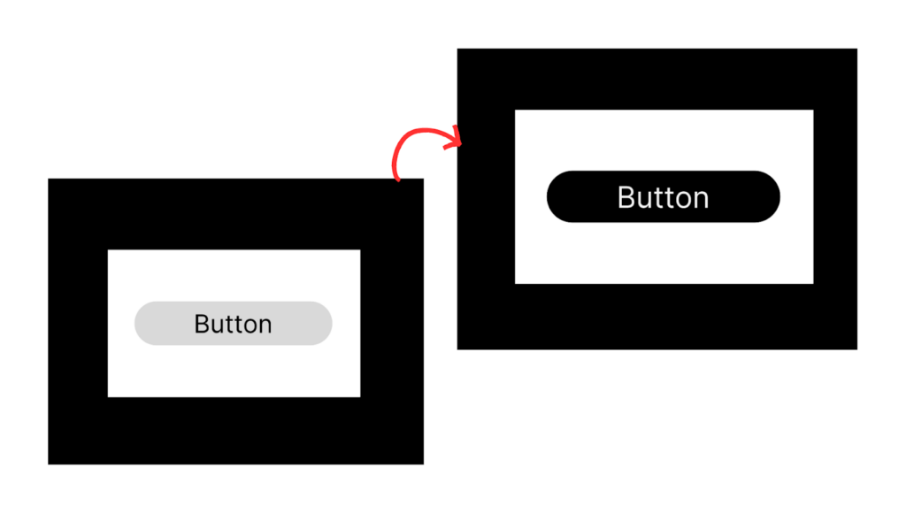
Now, it’s showtime for the Figma button hover effect. Click the play button in the top right corner and start the hover animation in Figma.
You can see the difference in the button when you hover the cursor.
Congrats! You’ve created the hover effect in Figma.
Button hover effects can make a world of difference in enhancing the user experience of your design projects. But why are more and more designers turning to Figma as their go-to design tool? The reasons are plentiful!
- Figma’s versatility is unmatched when it comes to handling various design tasks, such as UI/UX design, graphic design, and prototyping.
- Figma’s cloud-based collaboration capabilities are also a major draw, as teams can work on designs together in real time.
- Figma offers integrations with a variety of tools, such as Jira, Trello, and Slack, making it easier for teams to manage their design projects and collaborate with other teams.
Conclusion
Figma makes creating unique and eye-catching designs a breeze. Whether you’re a seasoned designer or just starting, Figma has the tools to bring your ideas to life.
So why not give the button hover effect a try in your next design project? With Figma’s powerful design capabilities, you can take your designs to the next level and create a truly unforgettable user experience.
Frequently asked questions: Figma Hover Button Effect
Yes, you can create different Figma button hover effects for different states of an element. For example, you could create a hover effect for when the element is in its normal state and a different effect for when it’s in a pressed or active state.
You can preview hover animation in Figma using the “Preview” feature in the prototype mode. This allows you to see how your design will behave when the user interacts with it, without needing to export it to another program or device.
Also read: