Unlike single and multiple-word logos, two-word logos are pretty balanced. They don’t have too many words to cause a distraction easily, nor too few words to make them unappealing. They are balanced in both quantity and quality. which easily allows them to attract more customers and deliver your message to their audience without any problems.
Many popular brands like Red Bull and Burger King have used the two-word style for their own logo designs. You know the result: both companies are among the top businesses today! which quickly proves how useful and unique two-word logos can be. And maybe that’s the reason why in this article we are going to present you some of the most famous two-letter logos!
It doesn’t matter if they are two words or two letters; as long as they are designed in this style, it’s almost impossible for them not to get recognized. Therefore, make sure to read this article to the end so that you get some good ideas and inspiration for your own two-letter logos!
Similar: Famous Streetwear Logos & Brand Names
10 Popular Two-Word Logos For Design Inspiration
Today we have compiled a list of 10 famous two-letter logos in this article; it’s guaranteed you know about almost all of them. So make sure you take ideas from them to design your own!
1. Burger King
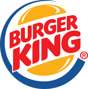
Burger King is one of the top fast food services worldwide. Throughout their journey, they changed their logos multiple times, but the current one is the most iconic and popular one, which is why they haven’t changed it for years.
This logo contains two burger patties on the top and bottom to make the design look tastier.
It also has curvy-shaped letters, which perfectly appeal to any customer who sees them. Then comes the “Burger King” name colored in red to create an appealing effect, and lastly a blue crescent to show Burger King’s reach worldwide!
2. Dunkin Donuts
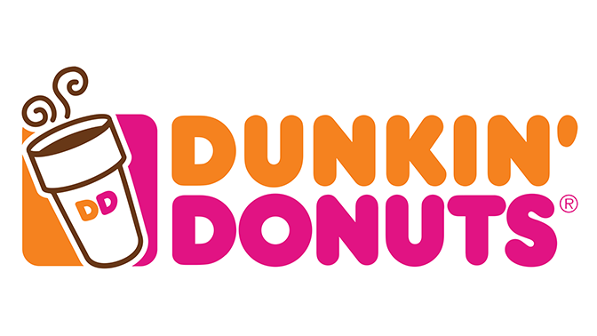
Who doesn’t love Dunkin Donuts? They probably sell the best donuts in the whole world, but they have another great thing about them, which is their logo. a simple yet cute logo, colored pink and orange. These two colors fit together really well, which makes this logo even more attractive.
Furthermore, just like Burger King, Dunkin’ Donuts also went through many logo changes, but their 2017 is considered the best one by fans. It had their name and their traditional colors: a coffee cup and a donut, the two items they sell most to represent their work.
3. Best Buy
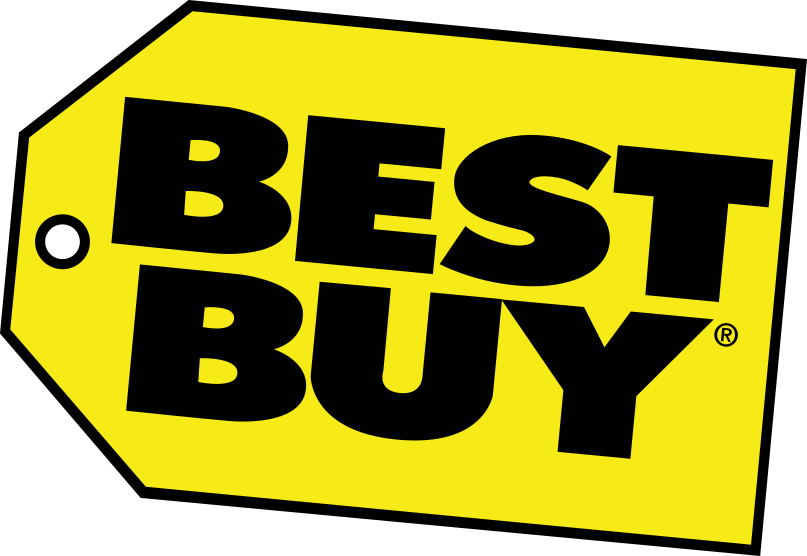
Best Buy’s logo is probably one of the most recognizable logos today; it was changed many times throughout the company’s progress, just like every other company’s. However, their most famous design is the current one, which is a really beautiful two-letter logo.
It’s designed with bold sans-serif type, which gives this logo good readability. It’s colored black as well, which is used to make the logo even more eye-catching. Lastly, there’s a small yellow price tag to represent their brand easily!
4. Baskin Robbins
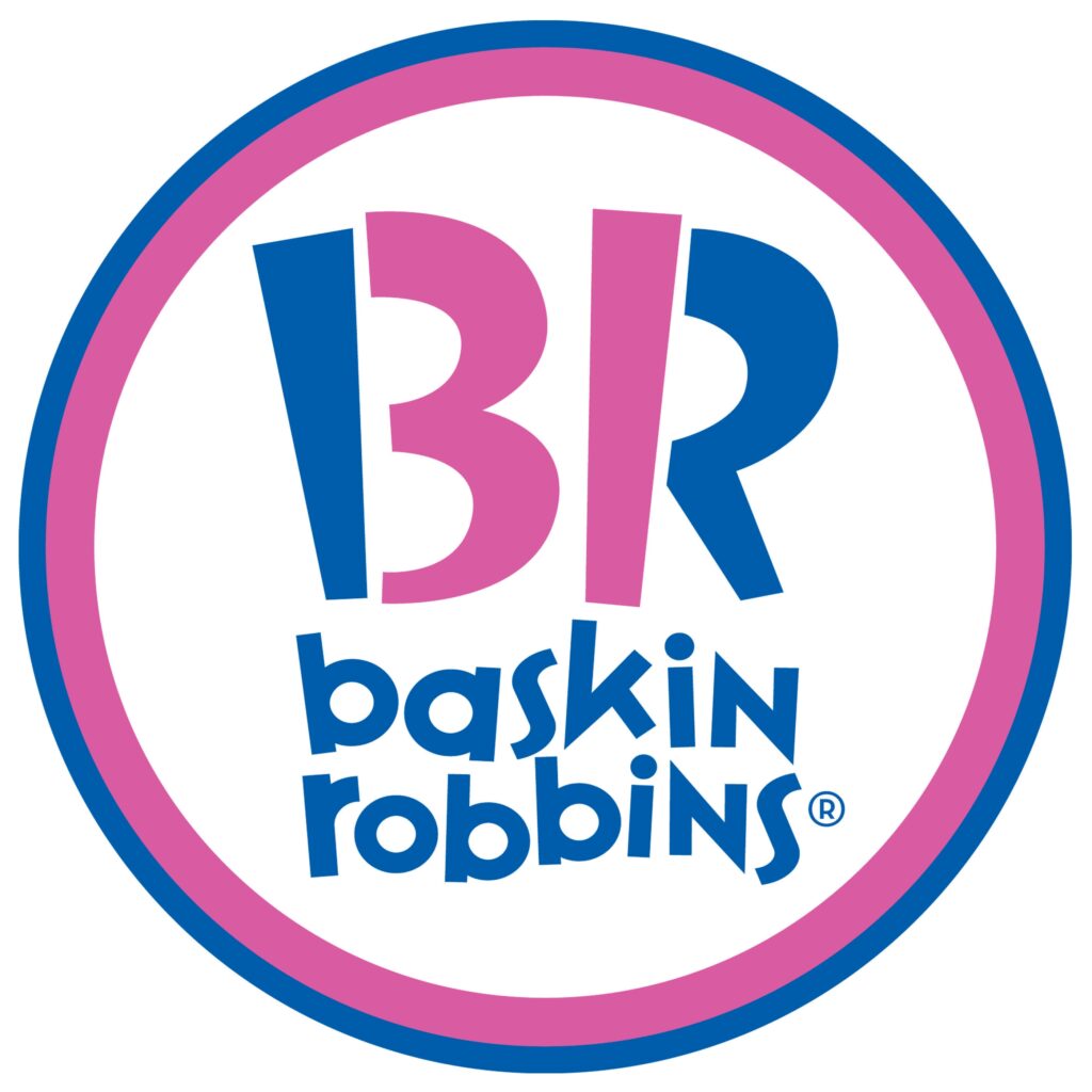
Baskin-Robbins is really popular for its ice creams, and they have the most unique and interesting logo in this list. At first, you can see a “B” and an “R” in blue and pink, which are colored that way to attract customers, and these two colors are often used for ice cream.
However, if you look closely, you will see a hidden 31 in the pink part of the logo. This number represents the number of ice cream flavors they sell, and they want their customers to taste one flavor each day of the month.
5. Calvin Klein
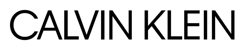
Calvin Klein’s logo has always been almost the same throughout its history. Just a simple two-word logo, with their name designed in a lightweight sans-serif font. They intentionally do this because this style represents professionalism as a fashion brand.
The black color easily represents charm, grace, elegance, and sophistication, all of which are important for any fashion logo.
6. M&M’s
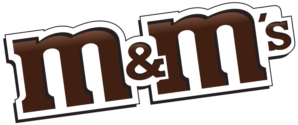
Our childhood would be really boring if we didn’t have M&M’s multi-colored button-shaped chocolates as our snacks. That’s why we should thank their logo; otherwise, they wouldn’t be this successful today. M&M’s logo is a quite simple design, colored brown, which represents their candies.
Unlike many brands, they have always used lowercase letters in their logo; they never revealed why they do this, but it may be because they are appealing to kids.
7. Comedy Central

Comedy Central never had repetitive logos; whenever they wanted to update their designs, they made sure the newer ones didn’t look like the previous ones. These logos are always minimalist, stylish, and simple, and their constant changes represent this channel’s progressive and creative working style.
However, their current logo is quite energetic compared to others because of its yellow color, and they have a yellow crescent too, which probably represents their popularity worldwide.
8. H&M
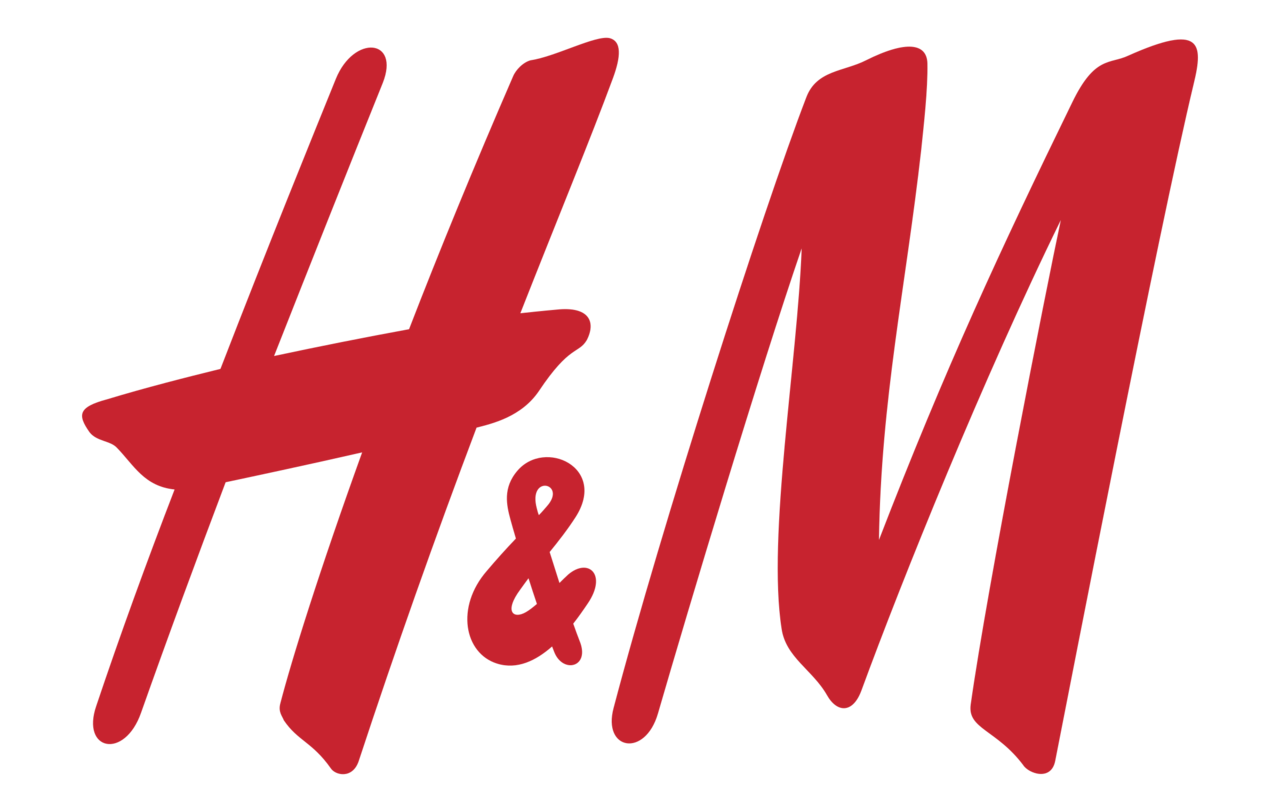
At first, H&M used to be just Hennes and used to sell only women’s clothes, but later, when Marutiz joined Hennes, the company became Hennes & Marutiz. H&M is just an abbreviation of their company’s name, and they kept it this way because it was easier to read and recognize the logo.
H&M is also a good logo to represent their male and female clothing too, which is why even today the logo remains the same.
9. Louis Vuitton
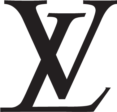
Louis Vuitton is one of those brands that refused to change their logo because they always knew they were perfect from the start. This logo contains an “L” and a “V” fused together to design a beautiful logo. This L and V are just an abbreviation of the company owner’s name.
Furthermore, Louis Vuitton’s logo is often colored black or gold to show its professionalism and grace. This also represents their clothing culture as well.
10. Red Bull
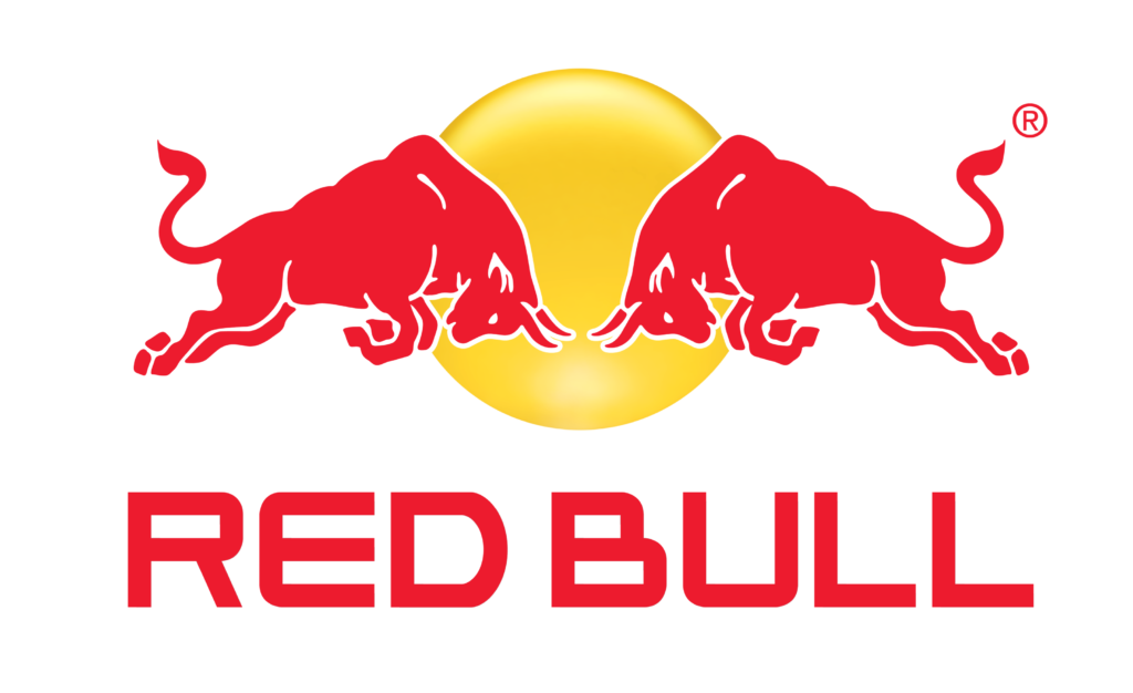
Let’s end this list with the Red Bull logo. a famous two-letter logo that really gave itself wings. First of all, it has two red bulls trying to strike each other, which represents the red bull’s name, confidence, strength, and stamina. Then there’s a yellow circle behind the bull, which represents the brand’s timelessness.
Lastly, the colors blue, red, and white are used. Red represents energy and strength. Blue symbolizes the relaxation you feel after drinking the beverage, and white is obviously for peace.
Conclusion
No matter what century, two-word logos will always remain memorable, and above we have mentioned the most famous two-word logos ever. Make sure you observe them very well so that you get some ideas and inspiration to design your own!