Today’s logos are really outstanding; they are colorful, modern, eye-catching, and never fail to grab the audience’s attention. But did you know the logos from the 1980s were even better than the present ones? Yes, you read that right. Although logo design has improved over the years, there’s nothing that can beat the 80s logos.
It doesn’t matter whether they were fast food brand logos, video game company logos, or TV channel logos. All of them had well-detailed designs, which made them really iconic. It’s guaranteed you can recognize most of the 80s logos since many people have grown up with them.
Their retro style can still evoke nostalgia in many people, which is why they aren’t forgotten even today. And that’s the reason why in this article we are going to present you with some of the most popular 80s logos! So make sure to keep reading till the end and see if you still remember these logos or not.
Similar: Famous Streetwear Logos & Brand Names
12 Logos From the 80s That Are Still Unforgettable
1980s logos had the best designs in history, and below we have mentioned the 12 most popular 80s logos. Maybe you can take inspiration from them to create your own designs, so do not skip any of them.
1. MTV
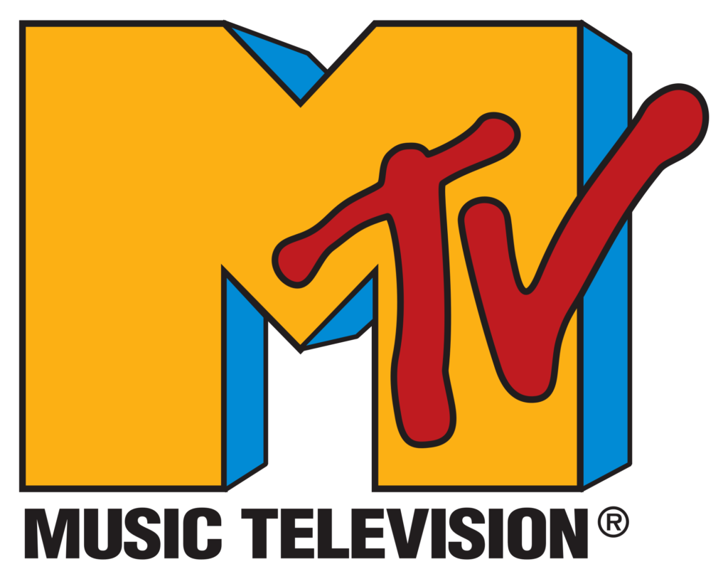
MTV is a popular youth music channel that had a graffiti-themed logo in the 1980s. This logo was designed like this to represent independence and freedom, which is something every young and teen person loves. Also, graffiti art was popular among the young generation in those days, so they didn’t waste time and designed their logo with it, which easily helped them gain many audiences.
Lastly, the large and appealing M in their logo is used to represent music, which is their channel’s main niche.
2. Pepsi
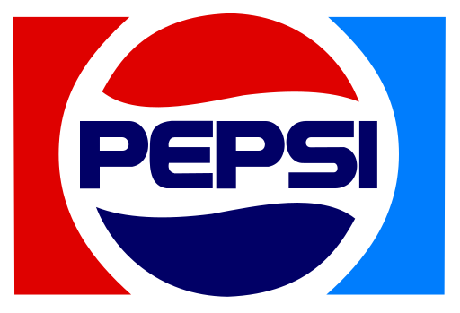
Surprisingly, most of Pepsi’s logos are almost identical. a red and blue circle with white space between them. And Pepsi’s 1980 logo had this theme too. Actually, this red and blue color were used because Pepsi wanted to outrank Coco Cola, a competitor brand that used red for its logo.
As everyone knows, red is a really attractive color. Therefore, to compete with Coca-Cola, Pepsi used blue along with red, which made their logo more attractive than the cola brand.
3. Burger King
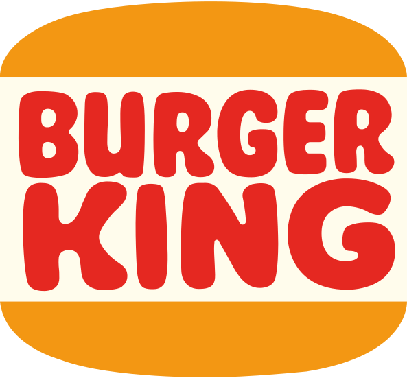
Burger King’s logo from the 1980s is one of the most popular logos in history. It was designed with bold letters, was colored red, and had buns like a real burger on the top and bottom sides of the logo. This design was directly used to represent what they do, which is sell tasty burgers.
Even today, people love this logo, which is why, in 2021, Burger King brought it back.
4. Nike
No matter what century, Nike has always kept its logo the same. brand’s name in black with bold letters for an appealing effect and a wing or tick mark. It has always been so simple, and even in the 1980s, it remained the same: simple yet effective.
Many people wonder what the tick or wing in this logo means, so here’s the answer: the wing in the Nike logo is used to represent a Greek goddess who symbolizes motivation, power, and speed.
5. Toyota
Toyota’s current logo is really well known because of its unique design, which includes a metal oval that has several ovals inside it. However, the 1980s logo was a lot different than this. Since it was just a simple logo with bold letters colored in red.
At that time, it was really minimalist, not too stylish but still beautiful and attractive because of its simple style.
6. Adidas
The Adidas logo represents a mountain, and everyone knows that, but did you know the popular 80s logo was way more iconic than that? It was known as the Trefoil logo and was designed in 1971. This logo included a leaf-like design with three stripes.
The leaf part had three different ends, which represented the three parts of the world (North America, Europe, and Asia), the places where Adidas was available.
7. Atari
Just like many other brands, Atari’s logo hasn’t changed a lot over the years. Its first logo was designed in 1972 and had a special “A” before the brand name. This A was designed with three lines that connected to each other at the top point.
It actually symbolizes a road or tower, and since engineering is their niche, this design was a perfect pick for the logo.
Furthermore, the A stands for movement, progress, and improvement as well.
8. Microsoft
1980 was the first time Microsoft changed its logo; it used to look way different from the current one. It was really metallic and stylish. Not to mention, they probably used a techno font to give a futuristic look to their brand.
Letter edges were sharp, and letters like M, R, and F exceeded the logo, which gave it an even more metallic look.
Microsoft probably adapted this style because they were inspired by metal bands of that generation.
9. Apple
The Apple logo from the 1980s, the logo that gave birth to their iconic half-bitten apple design. The first logo was quite boring and didn’t represent their brand properly, so they wanted a better design, so they created the half-bitten apple.
It was rainbow-colored, which represented the first computer color, and their apple is bitten because a perfect apple would make people think it’s a cherry.
10. Hot Wheels
Hot Wheels have used almost the same logo ever since they were released. which included their brand’s name on a flame flag. This flame flag represents car races and how their tires burn during races. They wanted their customers to feel the same while playing, which is why it’s designed like that.
Furthermore, this flame symbolizes attitude, speed, confidence, endurance, and many other positive feelings as well.
11. Nintendo
Nintendo is one of those brands that has changed many logos throughout its journey and finally found the best logo for its brand. However, in 1980, they were still looking good. At that time, this company was still very popular and had a minimal and simple logo with just its brand name.
This logo was originally colored black for more attractiveness but was changed to red later because red is the national color of Japan.
12. McDonald’s
Did you know the logo McDonald’s had in the 1980s is still used today? Yes, you read that right. This logo was designed in 1975 and has its iconic yellow curvy M, which makes the design friendly and tasty. This M was put inside a red square, which is supposed to represent happiness and a cheerful environment.
Lastly, they had their brand’s name in the middle of a large M, colored in white, which completed the logo, and even today, a similar logo to this design is used.
Conclusion
Vintage logos are really iconic; it’s really hard to forget them as they always remain in our hearts because of their amazing style. We have mentioned the most popular 80s logo in this list; which one was your favorite?