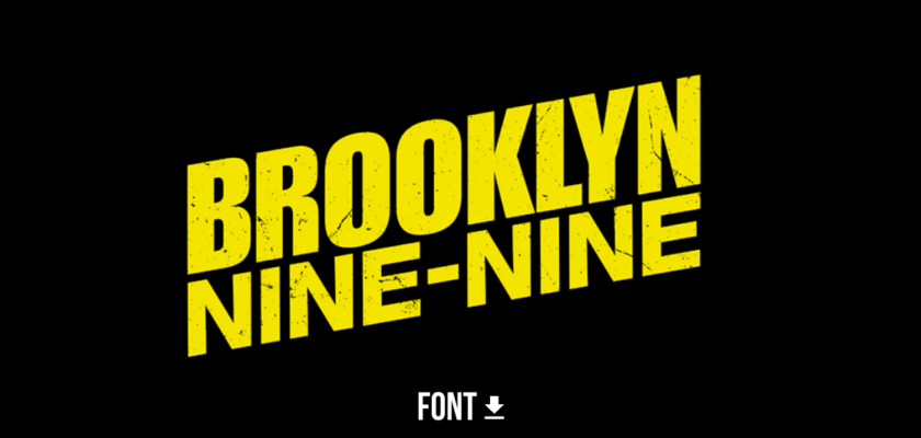
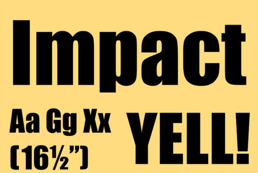
Are you looking for the font used to create Brooklyn Nine-Nine? Then you are in the right place. The fonts that are used to create the Brooklyn 99 title card are Impact and Helvetica 86 Heavy Italic.
Whether you’re a designer looking to emulate the show’s style, or just a curious fan who wants to know more, this article will give you all the details on the font that has helped make Brooklyn Nine-Nine one of the coolest cops shows on TV.
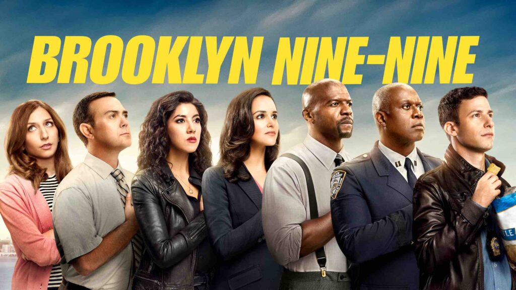
The title card of Brooklyn 99 is simple and easy to read, which undoubtedly contributed to the show’s popularity. This show has got everything from Peralta’s antics to Terry’s muscle flexin’.
You can download this font from below for free. Check out our Tv Font Collection for more fonts.
Similar: Peaky Blinders Font
Brooklyn 99 Fonts
1. Impact
- File Type: OTF
- Font Type: Bold
- Creator: Stephenson Blake
Impact Free Alternative
If you are looking for a free Impact alternative, try using this font. It’s free to download and use, similar to the Impact typeface.
Check out ArTarumianMHarvats font
2. Helvetica 86 Heavy Italic

- File Type: OTF
- Font Type: Bold Italic
- Creators: Max Miedinger, Edouard Hoffmann
Helvetica 86 Heavy Italic Free Alternative
Check out Dyno Bold Italic Font
About Brooklyn Nine-Nine
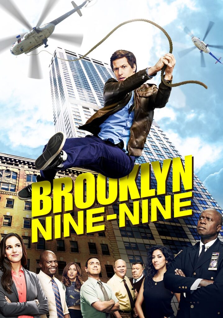
Brooklyn Nine-Nine (99) is a comedy TV series created by Dan Goor and Michael Schur. It contains 7 Seasons. The main character Jake Peralta is played by Andy Samberg.
It’s amazing how much a simple font can affect the overall look and feel of a TV show. So, the next time you’re watching Brooklyn Nine-Nine, take a moment to appreciate all the hard work that goes into creating the show’s unique typography.
We hope you’ve enjoyed learning more about the font used in the title and gained some insights into what makes the Nine-Nine so special.